Fantuan Mobile App Page Re-Design
Overview
I redesigned the Account page of the Fantuan mobile app to improve its previously cluttered UI and layout. I re-positioned the sections and used different UI treatments, including colors, component patterns, and new icon styles, based on my user perspective.
Problems
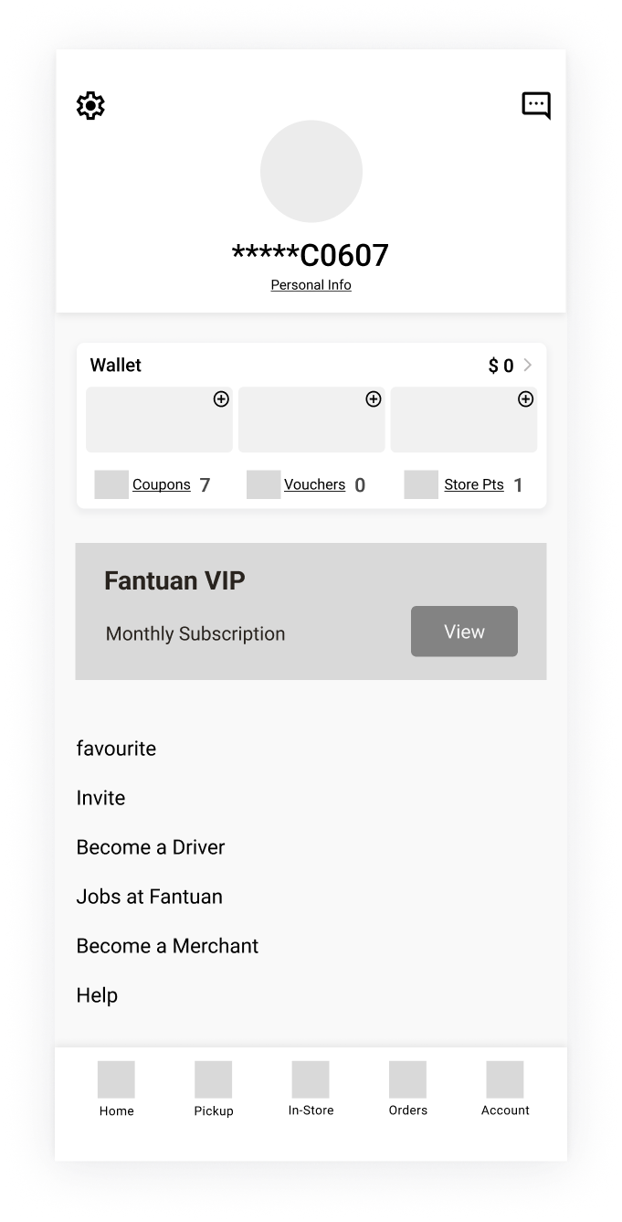
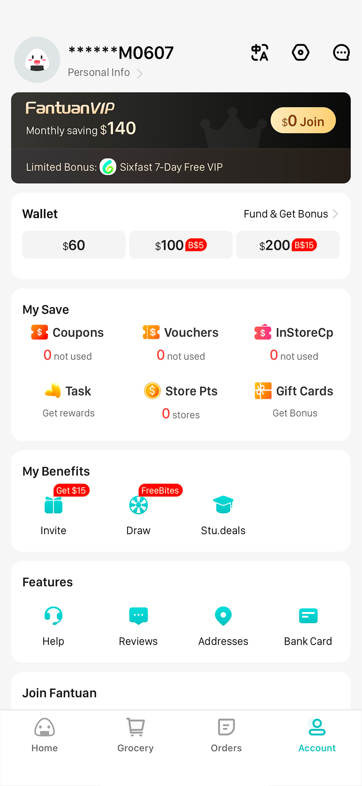
The screen below shows the original design of the Fantuan account page.

The personal information section is positioned in a corner, making it too small.
Frequently accessed features, such as coupons and gift cards, are mixed with less used features, making them difficult to navigate and use.
The bottom navigation bar uses outdated icons that are not prominent enough for users to discover the features.
The wallet section lacks displaying the informations such as remaining balance in your account.
Similar features are scattered across different sections.
Low Fidelity
Iteration A
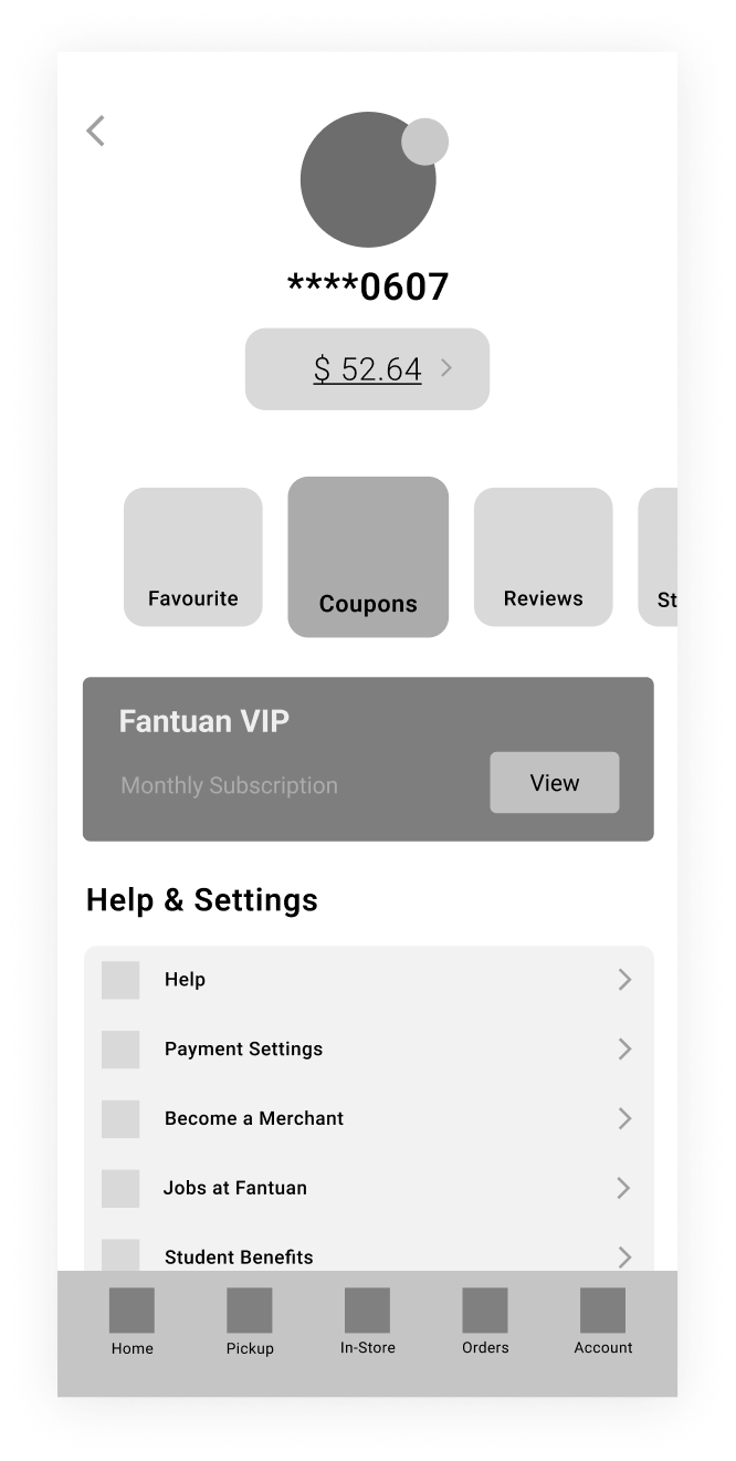
Iteration B
Iteration C
I simplified the layout by restructuring key UI elements such as repositioning profile images and wallets. I placed the wallet feature below the profile image to emphasize its importance. In Iteration B, I used a scroll pattern to group and display frequently accessed features.
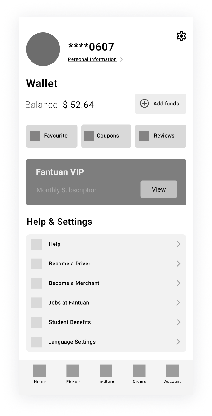
High Fidelity
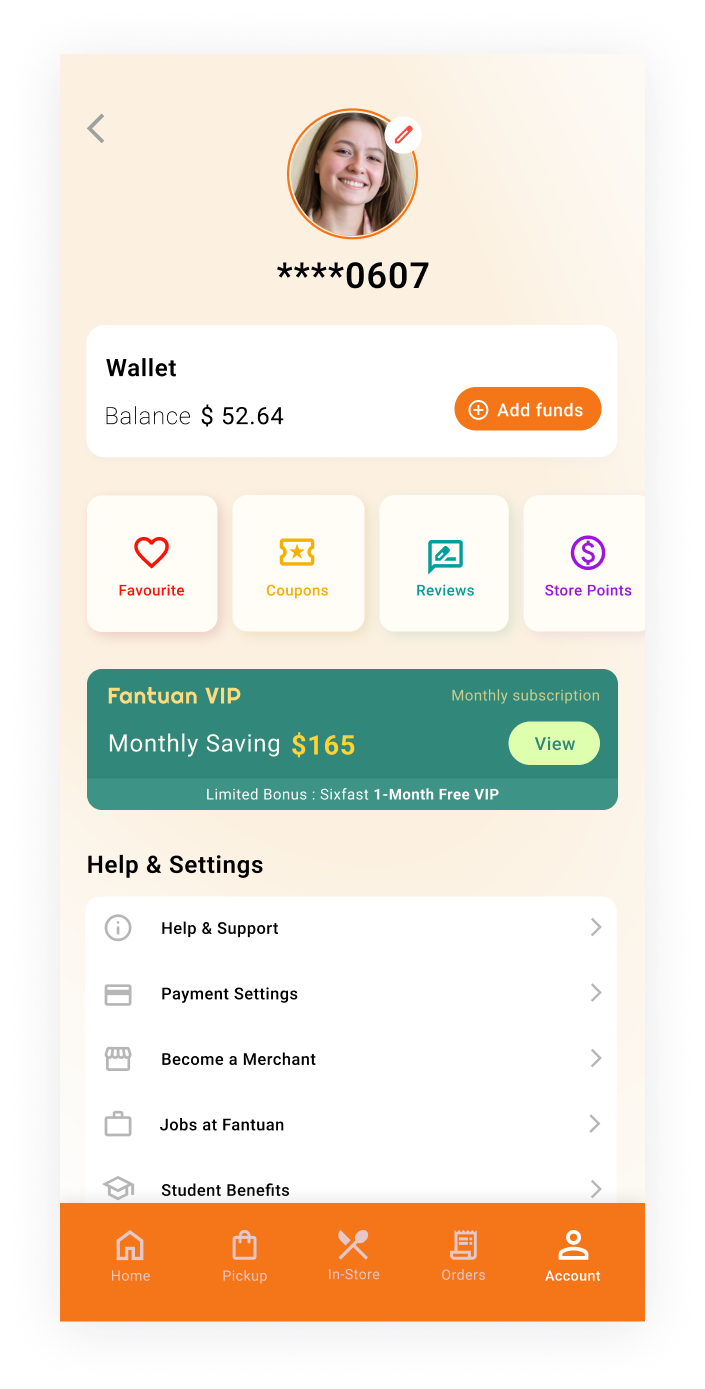
Iteration B-1
Iteration B-2
Iteration B-3
Iteration B-1
Design Intentions and Rationale: The first iteration featured a bright, vivid colour for the "Add Fund" button to make it the focal point of the screen. A vivid colour was also added to the scrollable box below it to show its importance.
Pros: High visibility of key actions; clear focal points.
Cons: The vivid colours might be intense, leading to distraction from other elements.
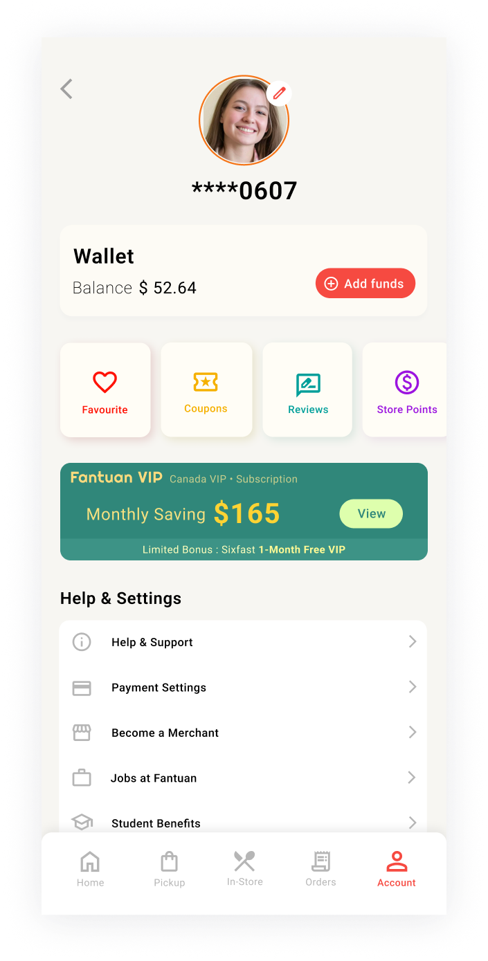
Iteration B-2
Design Intentions and Rationale: The second iteration used a bright pastel-toned orange gradient background, offering a fresh and modern aesthetic. The bottom navigation bar was changed to a vivid orange, creating a clear contrast that highlighted navigation options while maintaining a clean and balanced look.
Pros: Balanced design with a visually appealing background and clear navigation cues; modern colour scheme.
Cons: The vivid orange bottom navigation bar could be overwhelming for some.
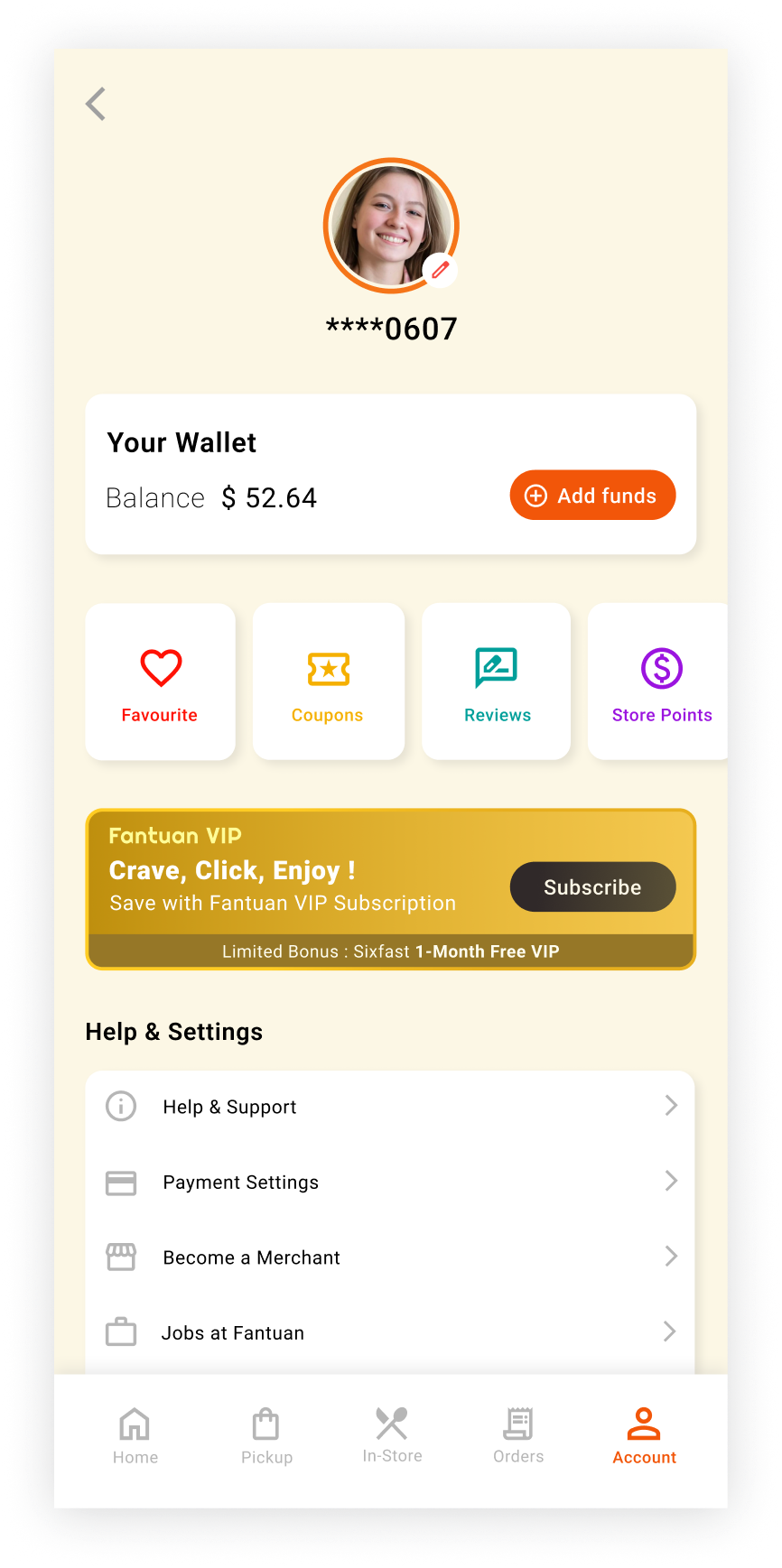
Iteration B-3
Design Intentions and Rationale: The third iteration shows simplicity and cleanliness by using less colours. The choice of a muted background and boxes is to enhance the focus, without overwhelming the viewer. The scroll boxes beneath the wallet feature are kept in minimalist colours to ensure they blend in with the rest of the design.
Pros: The design is minimalist and calm, which shows harmonious atmosphere.
Cons: The colours of the elements and the background can be difficult to distinguish.
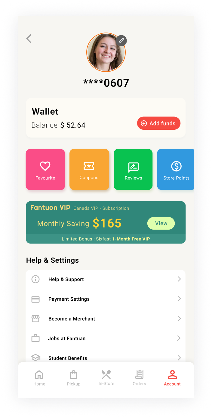
Final Design
Before
After
I chose this design for its balanced layout and modern colour scheme. The layout ensures clarity and ease of use by grouping similar features and placing important features, such as the profile and wallet, at the top of the screen. The modern colour scheme and icons enhance visual appeal and consistency. Since this project is UI-focused, I skipped user testing and prioritized designing an intuitive interface.
Summary
The changes from the original design to the final version aimed to enhance the UI. Key updates include reordering elements, adding a scroll pattern, and using color to highlight key elements. As a next step, user testing will identify pain points and gather feedback to further refine the design based on real user interactions.
Takeaways
-
I learned how color can be used not just for aesthetics but to highlight key actions and improve usability.
-
I discovered that grouping similar UI elements together enhances clarity.
-
I gained insight into how small UI adjustments, such as spacing and alignment, can significantly improve the overall interface.
-
I learned the importance of prioritizing elements through size, placement, and color to improve navigation.