top of page
Project Objective
I aimed to enhance the eBook experience by making it more immersive and reflective of each book’s unique mood and atmosphere. Through customizable UI features, I sought to develop a deeper connection between readers and their books.
Solution
I designed an app that allows users to customize the UI based on book genres or personal preferences, including color schemes, font styles, and background images, to enhance their reading experience. Integrated community features enable users to share and discover custom themes.
Role
UX/UI
Duration
4 Months
Tools
Figma
Adobe Creative Suite
Miro
Market Research
As a first step, I conducted market research to understand user behaviors and trends within the industry, focusing on how personalization and community features impact user engagement and retention. Key findings include:
1. User-generated content significantly enhance user retention, as demonstrated by platforms like Canva and Wattpad.
2. Apps with adaptive interfaces or personalized recommendations, such as Netflix and YouTube, show higher user engagement and satisfaction.
3. Platform that allow users to customize their interface or content layout, such as Notion, demonstrate that user control over design elements significantly boosts engagement and satisfaction by their needs.
User Research
The target audience includes readers aged 16 to 40 who have specific genre preferences and value flexibility, personalization, and immersive experiences. They seek distraction-free interfaces that align with the book’s mood and theme, avoiding cluttered layouts or intrusive gestures. Simple and intuitive customization tools are essential, allowing users to tailor their reading environment without feeling overwhelmed. Features that reduce visual noise and support deep focus are especially appreciated.
Why Users Choose eBook Apps
✦ Provides easy access to a wide variety of books at anytime, anywhere.
✦ Eliminates the need for physical storage.
✦ Offers low-cost options, including subscriptions or free content, with prices often lower than paper books.
✦ Enables easy note-taking, highlighting, and copying/pasting.
✦ Allows users to view and engage with others’ thoughts and comments seamlessly.
User Persona
Competitive Research
I conducted competitive research to understand market trends, identify gaps, and refine my approach. By analyzing competitors, I aimed to ensure my product offered unique value and effectively met user needs, including a fully immersive and personalized reading experience.
User Flow
I then created a happy path user flow to outline the steps users take to complete key actions, ensuring a seamless experience. Mapping the flow allowed me to identify opportunities for improvement and potential gaps in the process.
Hand Sketches
In the hand sketch phase, I quickly visualized design ideas, exploring layout and structure. These sketches helped identify usability challenges early and served as a foundation for refined wireframes.
Low-fi Wireframes
I then refined initial sketches into structured digital layouts, focusing on functionality and user flow. These wireframes provided a clear visual framework for the design, allowing for early feedback and iteration before moving to high-fidelity designs.
Hi-fi Screen Flow
In the hi-fi screen flow phase, I refined wireframes into polished, visually detailed designs while ensuring that screen flows and transitions were logical and user-friendly. In this stage, I focused on usability and aesthetics, providing a realistic representation of the final user experience before development.
Hi-fi Design
In the hi-fi screen designs phase, I finalized the visual elements, ensuring a polished and cohesive look across all screens. This stage focused on refining UI components, typography, and color schemes.
User Testing
I conducted a moderated usability test with 7 target users using a Figma prototype and a script containing 4 tasks. Based on the test results, I redesigned the screens to improve clarity and flow.
Testing Results (User Pain Points)
I gathered user feedback to evaluate the functionality, usability, and overall experience of the design. By synthesizing key insights, I identified areas for improvement, ensuring the final product aligns with user needs and expectations.
How I Addressed the User Problems
🤢 User Pain point
Some users expressed a desire to see more information about each book beyond just the title and author’s name. Others found the existing book cover images too small, making the text difficult to read. These issues made it harder for users to browse comfortably and quickly understand what each book offers at a glance.
💡 Updated design
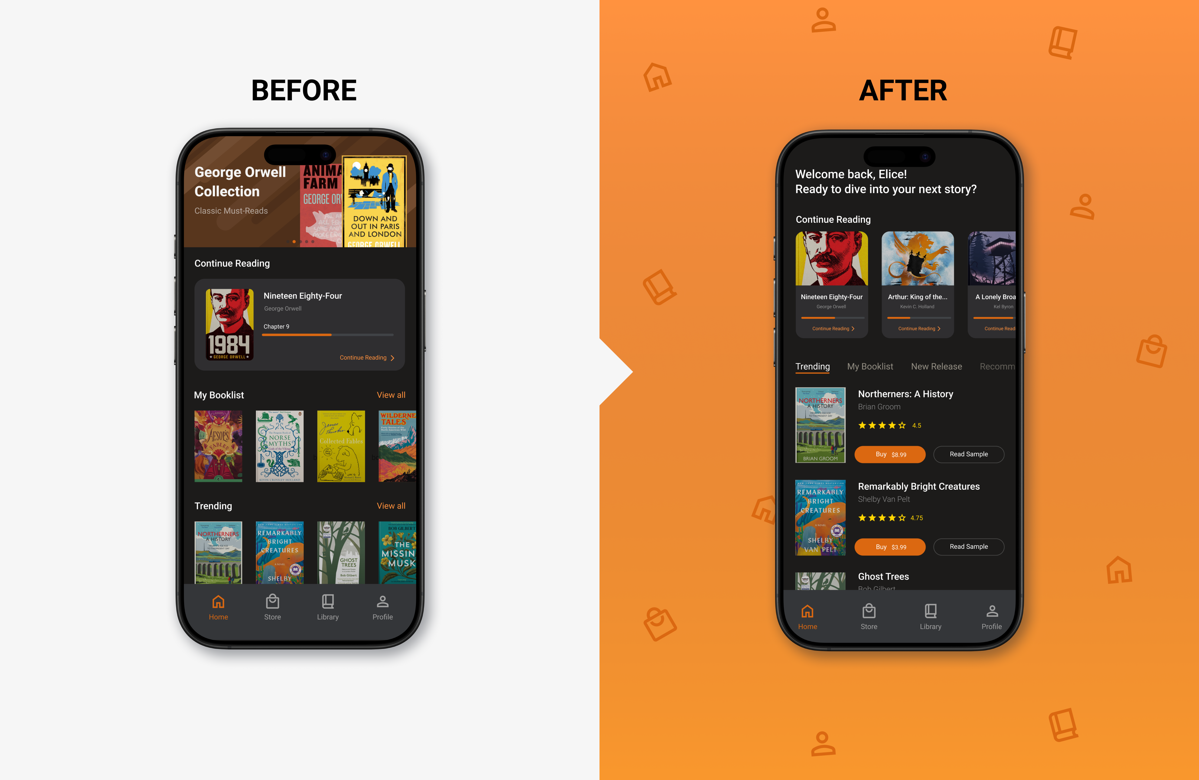
To address user pain points, I introduced a new view option. The original layout showed books in two rows with small images and truncated text, making details hard to read. The new design displays one book at a time with a larger cover, full title and author name, and visible ratings—allowing users to browse more easily view each item for detail information without clicking into each item.
🤢 User Pain point
Some users were unable to discover the Genres section because it was buried at the bottom of the screen, and several suggested it should be given higher visual priority. Additionally, users expressed interest in seeing a list of popular authors, which was not available in the current layout—limiting their ability to explore content based on familiar names or categories.
💡 Updated design
To address this pain point, I repositioned the Genres section to the top of the screen with a horizontal scroll, allowing users to easily browse through available genres. Advertisements were placed in the middle to avoid disrupting content flow, and a list of top authors, featuring their images and names was added at the bottom to support author-based exploration.
🤢 User Pain point
Some users wanted the ability to switch between multiple books they were reading, but the original home screen design only displayed a single “Continue Reading” item. This limited visibility made it difficult for users to easily return to other books they were actively reading, especially when managing different genres or reading goals simultaneously.
💡 Updated design
I redesigned the “Continue Reading” section to display three books at once in a horizontal scrollable container, allowing users to switch between books more easily. While the original design had side-scroll sections for “My Booklist” and “Trending Books,” the new layout introduces categories—Trending, My Booklist, New Releases, and Recommendations—at the top, each displaying books in a vertical list with larger covers, full titles, author names, and buy buttons for improved readability and interaction.
Responsive Design
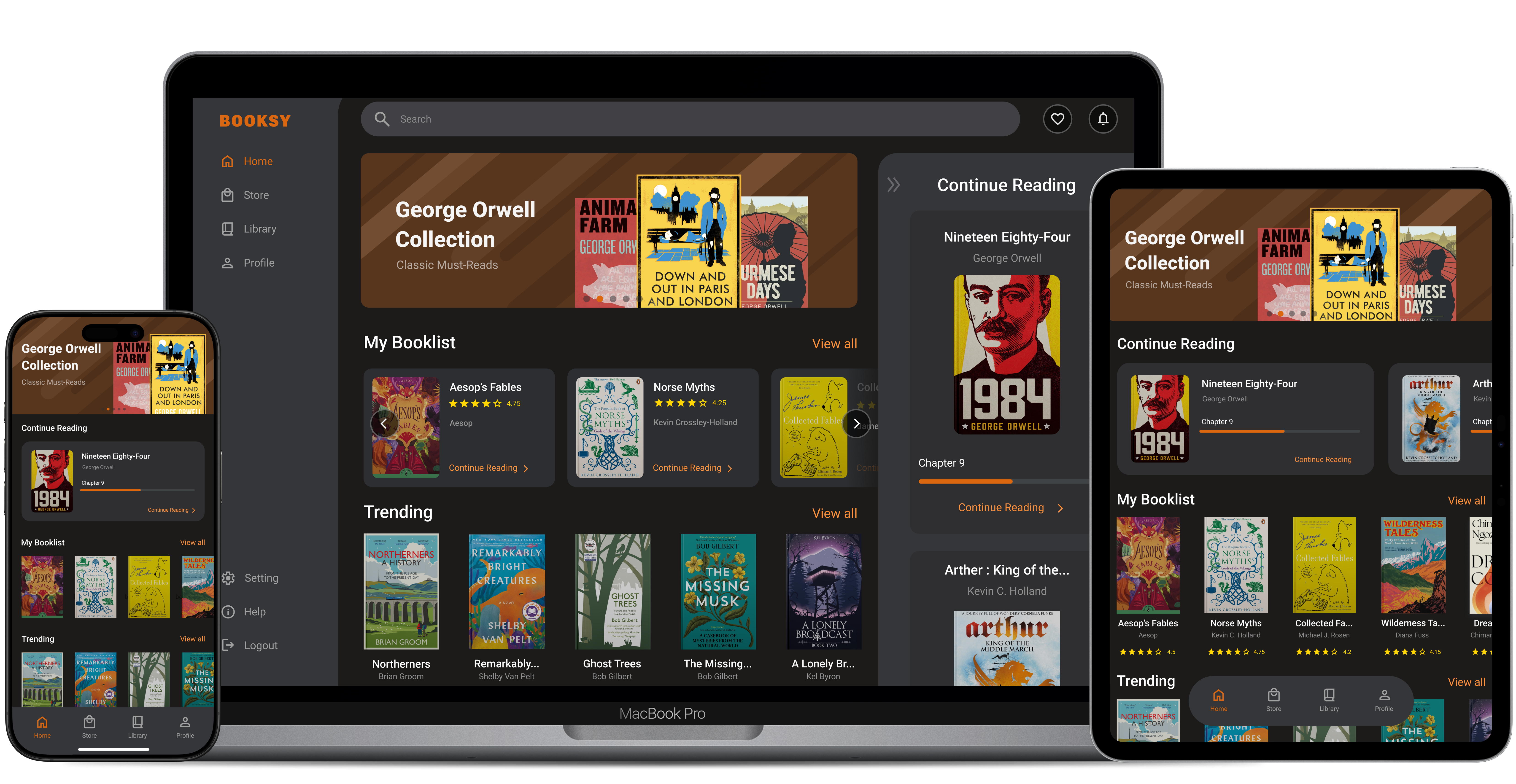
Focusing on UI, I designed responsive screens for mobile, tablet, and laptop. Mobile layouts feature thumb-friendly zones with a fixed bottom bar, while tablets use a floating bar and display extra content like “Continue Reading” cards. On laptops, navigation shifts to a left panel with chevron buttons for precise mouse interactions and smooth scrolling, ensuring a consistent, intuitive experience across screen sizes.
Other Design Considerations
Design System
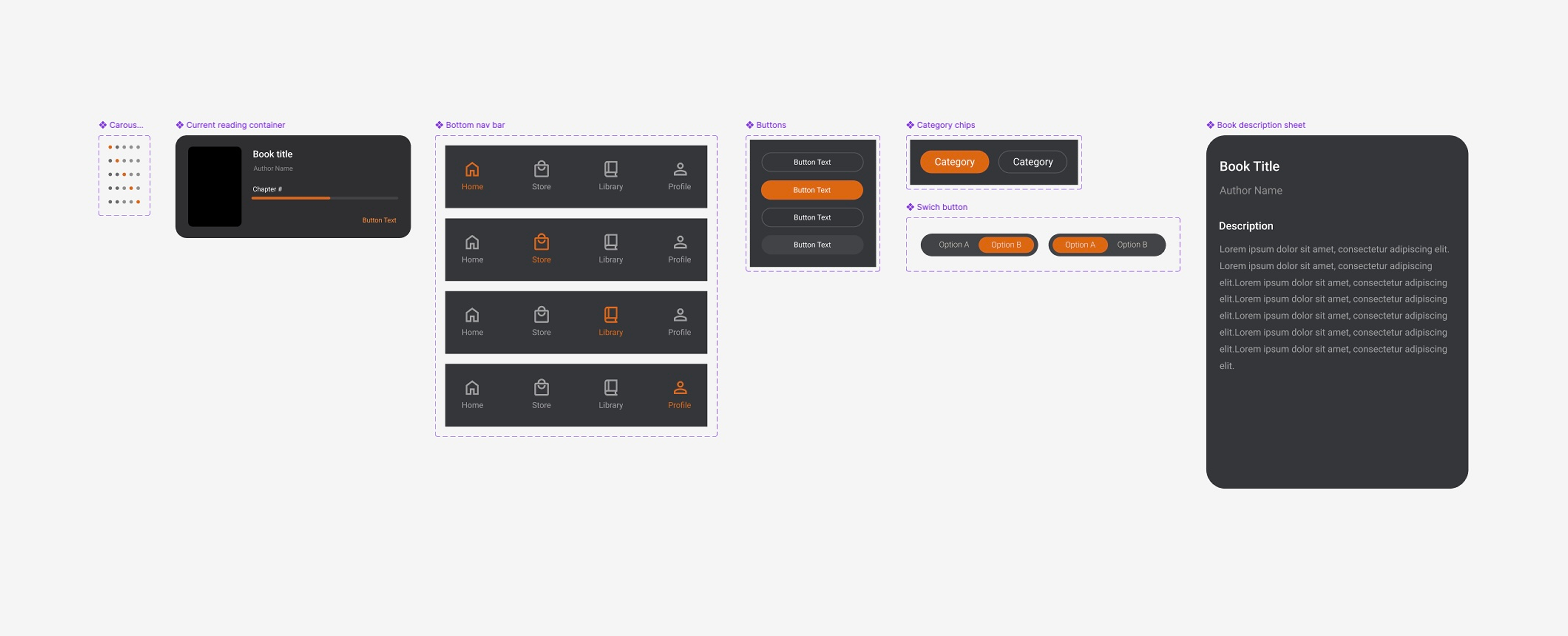
Although I didn’t fully develop a design system for this project, I worked to establish a cohesive set of UI components, typography, colors, and interaction patterns to ensure consistency across the product. I recognize the importance of design systems in streamlining development, improving scalability, and maintaining a unified visual language to create a seamless user experience across all screens and devices.
Contrast Check for Legibility
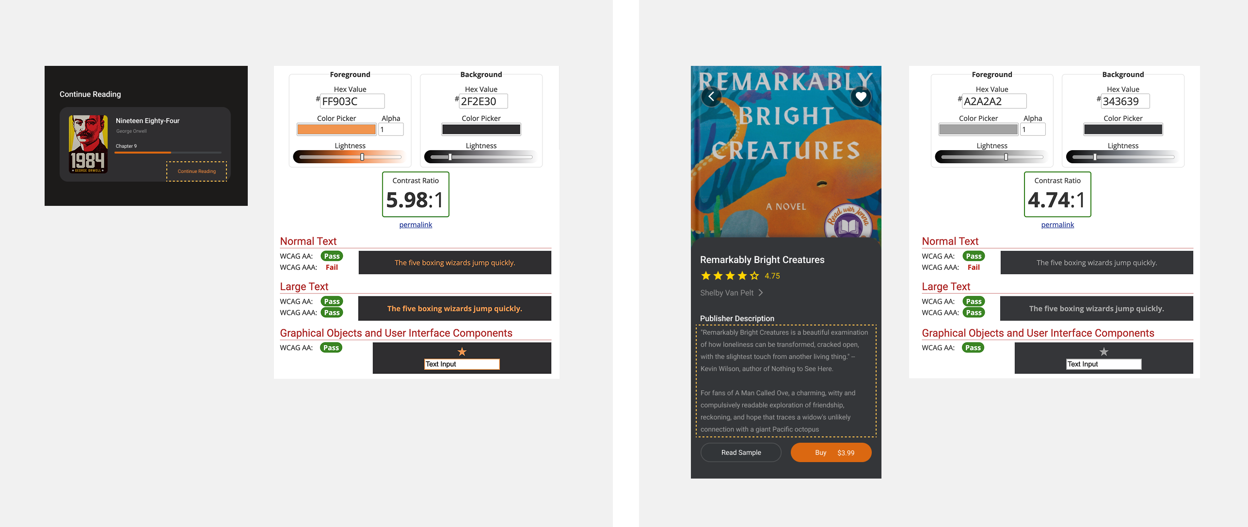
I ensured that all text elements were clear, readable, and visually balanced across different screens and resolutions. Including checking contrast and refining typography, I optimized readability to enhance accessibility and usability for all users.
Takeaways
✅ Through early user testing with a low-fidelity wireframe that I created, I gathered initial user feedback and assessed potential implementation feasibility and business viability. This approach helps minimize the risk of encountering significant UX or implementation issues at a later stage.
✅ While conducting user testing with participants matching the created user persona, I discovered that developing accurate user personas has a significant impact on creating effective UX/UI designs to address user problems.
✅ Conducting moderated user testing, I learned that providing clearly written task scripts to test participants is essential for obtaining accurate test results
Next Steps
☑️ I will conduct a further user research and testing, and consider adding an audiobook feature to enhance accessibility.
☑️ I will track and monitor user data, and improve the user engagement with the features accordingly.
☑️ Hypothetically, I’d collaborate with a marketing team to attract more new users.
☑️ I will develop the app experience for desktop and tablet platforms, based on further user research and data.
☑️ Understand the Backend requirements, including API calls needed to deploy the designs, along with their limitations, as well as the necessary Frontend implementation.
bottom of page