Interaction Design Research (TD Web app)
1
Accordion Dropdown
❇️ Component description
The Accordion is a collapsible container that reveals or hides information when clicked. It helps organize content into sections, reducing clutter.
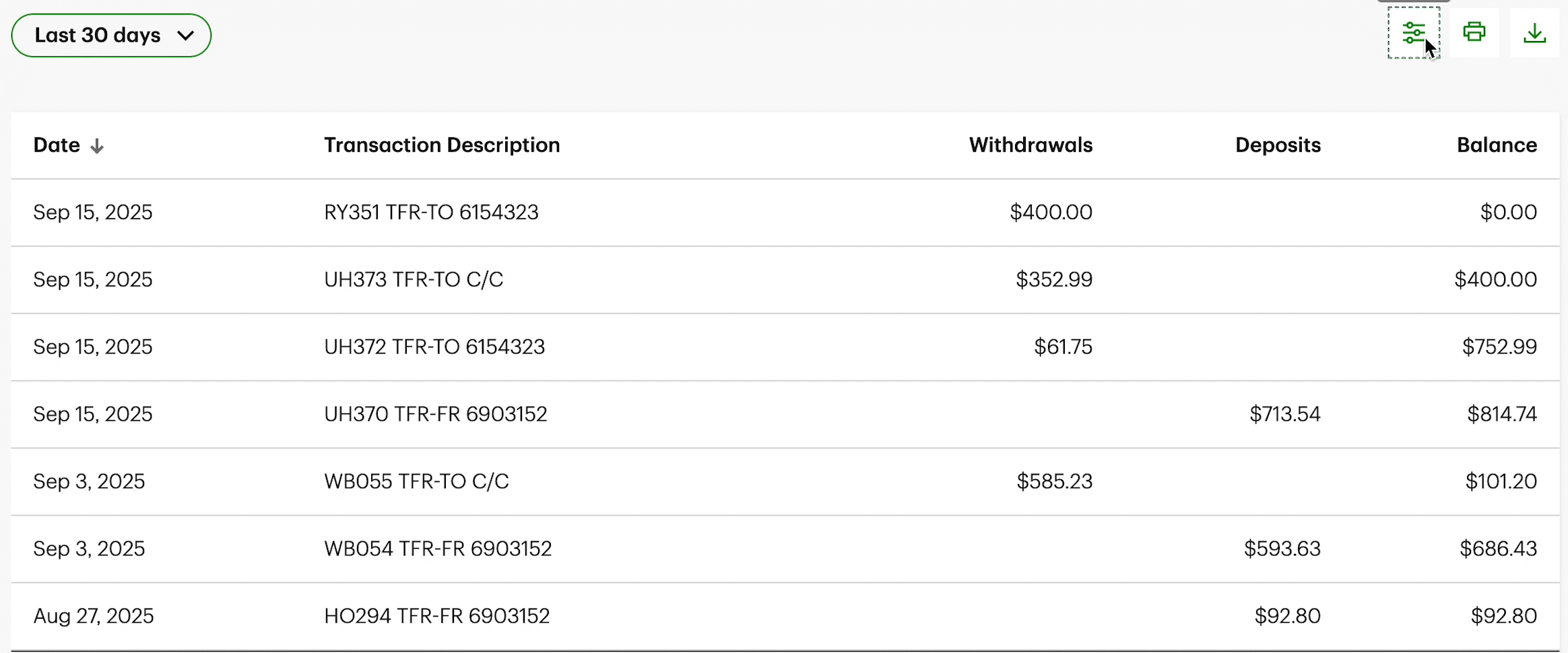
On the Transaction History page, clicking the filter icon triggers an accordion dropdown that reveals or hides filtering options, allowing users to refine displayed transactions efficiently.

Located at the bottom of the page, clicking the “Legal Notes” text expands a dropdown that reveals seven linked pages, providing users with access to detailed legal and policy information.
2
Collapsing Text Animation
❇️ Component description
The Collapsing Text animation occurs when a section is clicked, triggering the text to shrink in size as the content expands. This provides a smooth transition that draws attention to the newly revealed content while maintaining visual hierarchy and clarity.
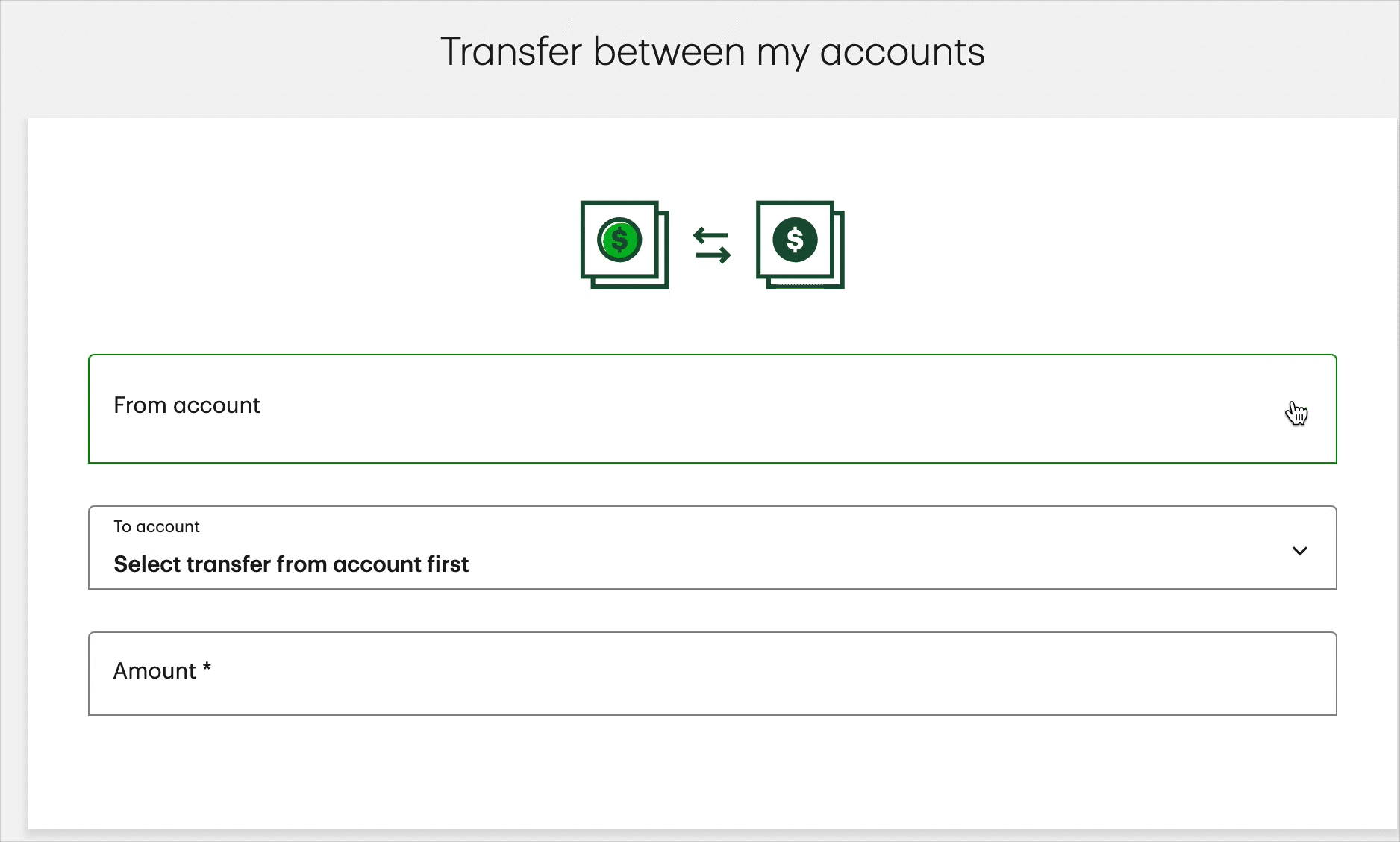
When a section is clicked on the Transfer between my accounts page, the header text smoothly shrinks in size.
3
Toggle Switch Animation
❇️ Component description
The Toggle Switch Animation lets users switch between two states, such as “Activity” and “Manage.” When clicked, the active label smoothly transitions with motions
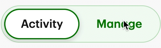
A two-state toggle that switches between “Activity” and “Manage.” When clicked, the active label smoothly transitions with motion feedback and navigates the user to the corresponding page.
4
Arrow Animation
❇️ Component description
Indicates expandable content within the “Description” section. When clicked, the arrow animates from upward to downward, visually signaling that additional information is revealed.
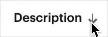
An arrow icon next to the “Description” text indicates collapsible content. When clicked, the arrow animates from pointing upward to downward, signaling the expansion of additional details.
5
Search Bar Animation
❇️ Component description
The Search Bar is a hidden input field that appears when the search icon is clicked. This interaction saves screen space while keeping search functionality easily accessible, providing a clean design and clear focus when activated.
When clicked, a search bar smoothly slides in from right to left, allowing users to search without leaving the current page.
6
Chevron Animation
❇️ Component description
The Chevron Indicator is an icon that rotates on click to reflect expand/collapse. It turns 180 degree when opened and returns when closed, giving clear state feedback without extra text.
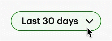
On the “Last 30 Days” tab, the chevron rotates 180° when clicked to indicate expansion. It shows additional date range options.
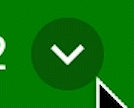
The chevron next to the Account section rotates 180° when clicked to indicate expansion.
7
Pill / Tabs Button
❇️ Component description
The Pill/Tab Button is a navigation element that lets users switch between sections. Its hover state changes colour to signal interactivity, providing quick visual feedback.
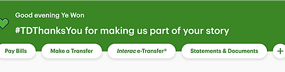
Normal state
The pill button is in white colour

Hover state
The background colour of the pill switches to light green when hovered
8
Tooltip
❇️ Component description
The tooltip appears when a user hovers over or focuses on an element, offering extra context without adding clutter to the interface. It shows as white text inside a black container with simple, concise labels such as “Manage quick action,” “Filter,” “Print,” or “More Action.”

The plus icon in an ellipse opens a window where users can manage quick action links. On hover, a tooltip labeled “Manage quick action” explains its purpose.

The printer icon lets users save the current window, with tooltip “Print.”
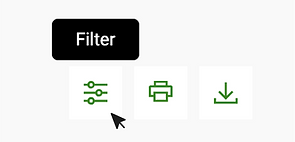
The filter icon allows users to customize account transaction views. On hover, a tooltip labeled “Filter” appears.

The vertical three-dots icon opens a menu with options like View Docs, Manage, and Setup. Tooltip reads “More actions.”
9
Underline
❇️ Component description
An underline appears only on hover. It provides subtle feedback, signaling clickable text or links without adding visual noise in the default state.
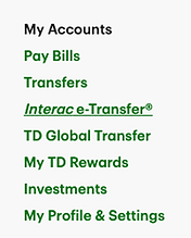
Under the “My Accounts” list, an underline appears on hover, indicating clickable navigation options.

An underline appears only on hover state for every accounts name and account number.
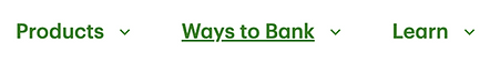
The top navigation bar includes categories such as My Accounts, Products, Ways to Bank, and Learn. Each displays an underline on hover, indicating interactive navigation.
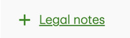
An underline appears on hover for legal notes text.
10
Hover State Color Change
❇️ Component description
The Hover State Color Change is an interactive visual cue where the section’s background changes colour when hovered. This effect signals clickability to the users.

Normal state
Every components are on normal state without changing any colours.

Normal state
Every components are on normal state without changing any colours.

Hover state
Section colour for each of the component changes on hover state.

Hover state
Section colour for each of the component changes on hover state.