Project Objective
I designed this app to solve the confusion and inefficiencies that often arise when splitting expenses during group trips. By allowing users to track who paid for what, assign payment responsibilities by amount or percentage, and account for discounts or exceptions, I aimed to create a clear, fair, and transparent cost-sharing experience tailored for group
Solution
I designed an app that lets users track and manage shared expenses during group trips by assigning payments based on specific amounts, percentages, or individual contributions.
Users can also log who received discounts and who covered which items, ensuring clarity and fairness. Built-in features for visualizing contributions and settlements help reduce misunderstandings and streamline the process of splitting bills among group members.
Role
UX/UI
Duration
6 Months
Tools
Figma
Adobe Creative Suite
Miro
Market & User Research
These survey questions are meant to find the pain points of the users who travels face when managing group expenses. They aim to see if unclear tracking has caused frustration or conflict and what issues people face when splitting costs. Questions about fairness and uneven payments show the need for more flexible options. By asking if everyone would join a shared app, even non-active members, the survey will test how open groups are to using one tool.
User Survey
To validate SplitMate’s concept and uncover pain points in managing shared expenses, I conducted a user survey focused on group travel scenarios. Five participants responded to questions about fairness, tracking clarity, and preferred platforms.
Key findings
-
75% experienced unfair expense splits, often due to unclear tracking.
-
Web apps were preferred for ease of access.
-
Top frustrations included manual calculations, lack of transparency, and confusion over who owes what.
-
Desired features included flexible splitting, auto-calculation, receipt uploads, and summary reports.
These insights confirmed that users are seeking solutions that prioritize fairness, clarity, and automation. The findings played a key role in shaping the next phase of the UX design by highlighting the importance of flexible splitting methods, transparent expense tracking, and streamlined group coordination. Grounding the design in real user needs ensured that the product direction remained both relevant and impactful.
Competitive Analysis
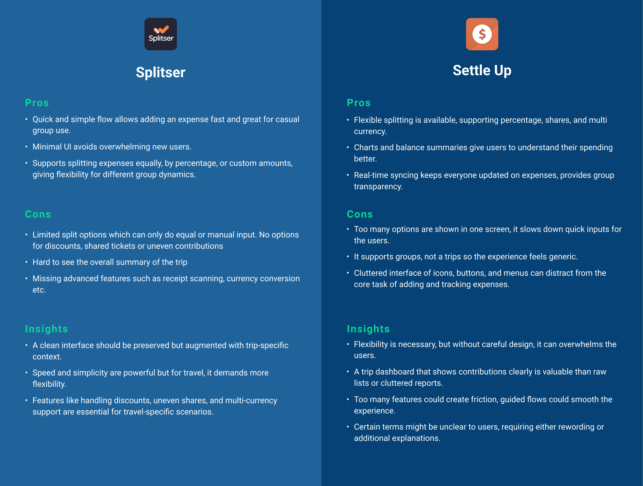
Both Splitser and Settle Up solve the general “who owes who” problem, but neither fully supports the unique complexity of travel expenses. By studying them, I identified specific gaps and opportunities that are guiding my design choices.
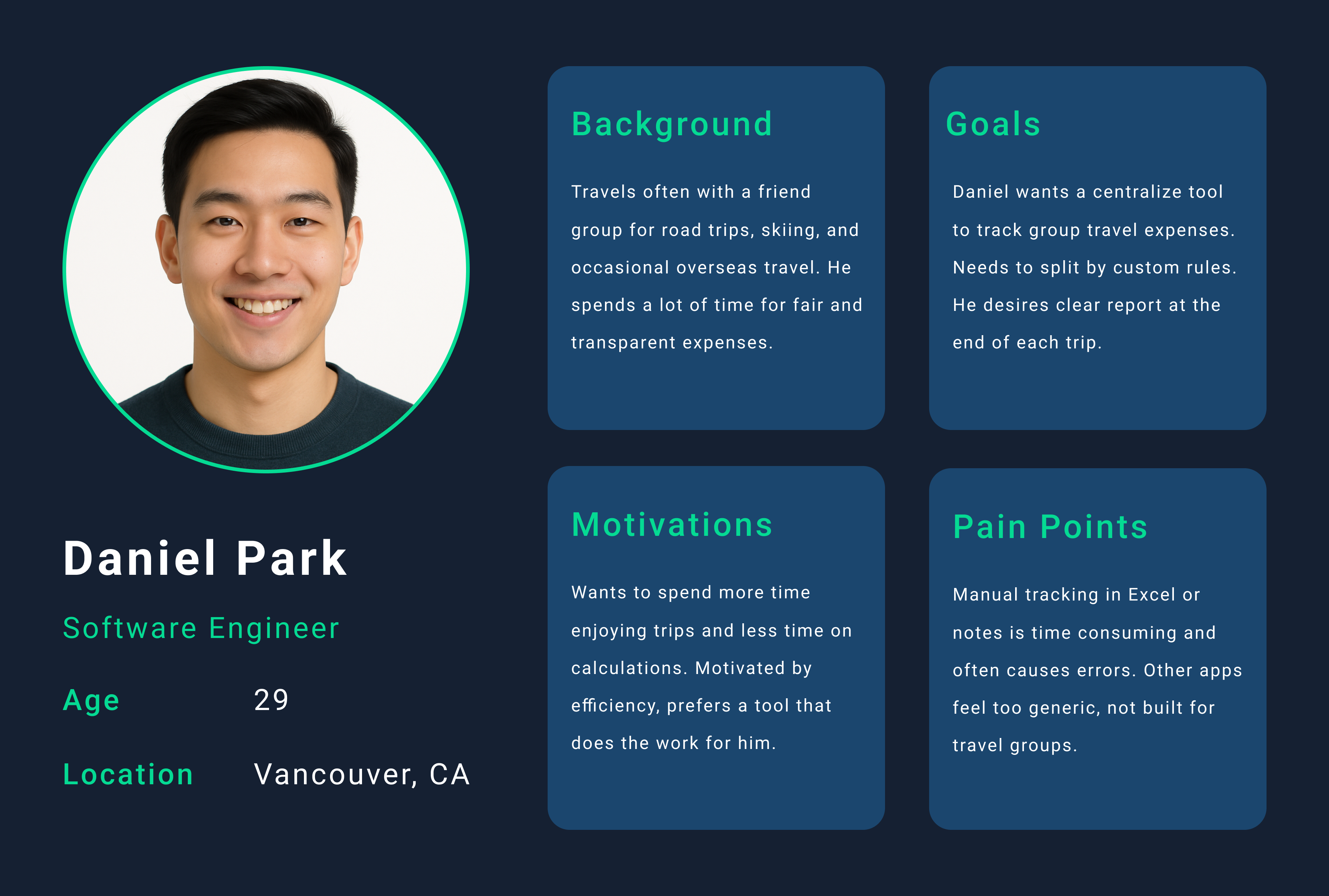
User Persona
User Journey Mapping
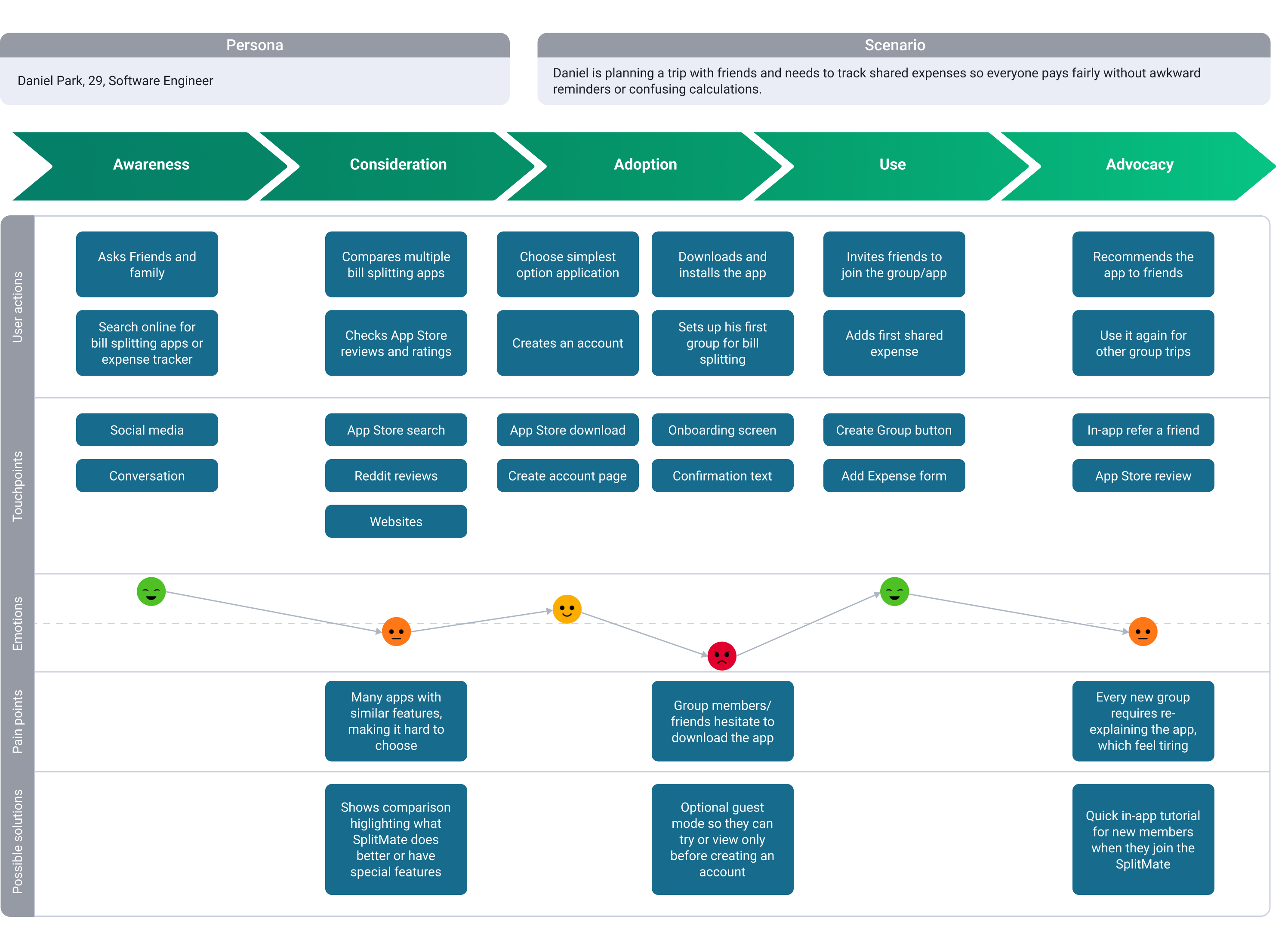
To design a product that supports the main user persona, Daniel Park, I created a user journey map that illustrates his experience from awareness through advocacy. This helped me understand not only what he does but also how he feels at each stage, from curiosity and hesitation to frustration and trust. By mapping Daniel’s actions, touchpoints, emotions, and pain points, I identified friction such as difficulty choosing between similar apps, hesitation from group members, and the repeated effort of explaining how the app works. These insights guided design decisions including a guest mode, streamlined onboarding, and in‑app tutorials.
Feature Prioritization
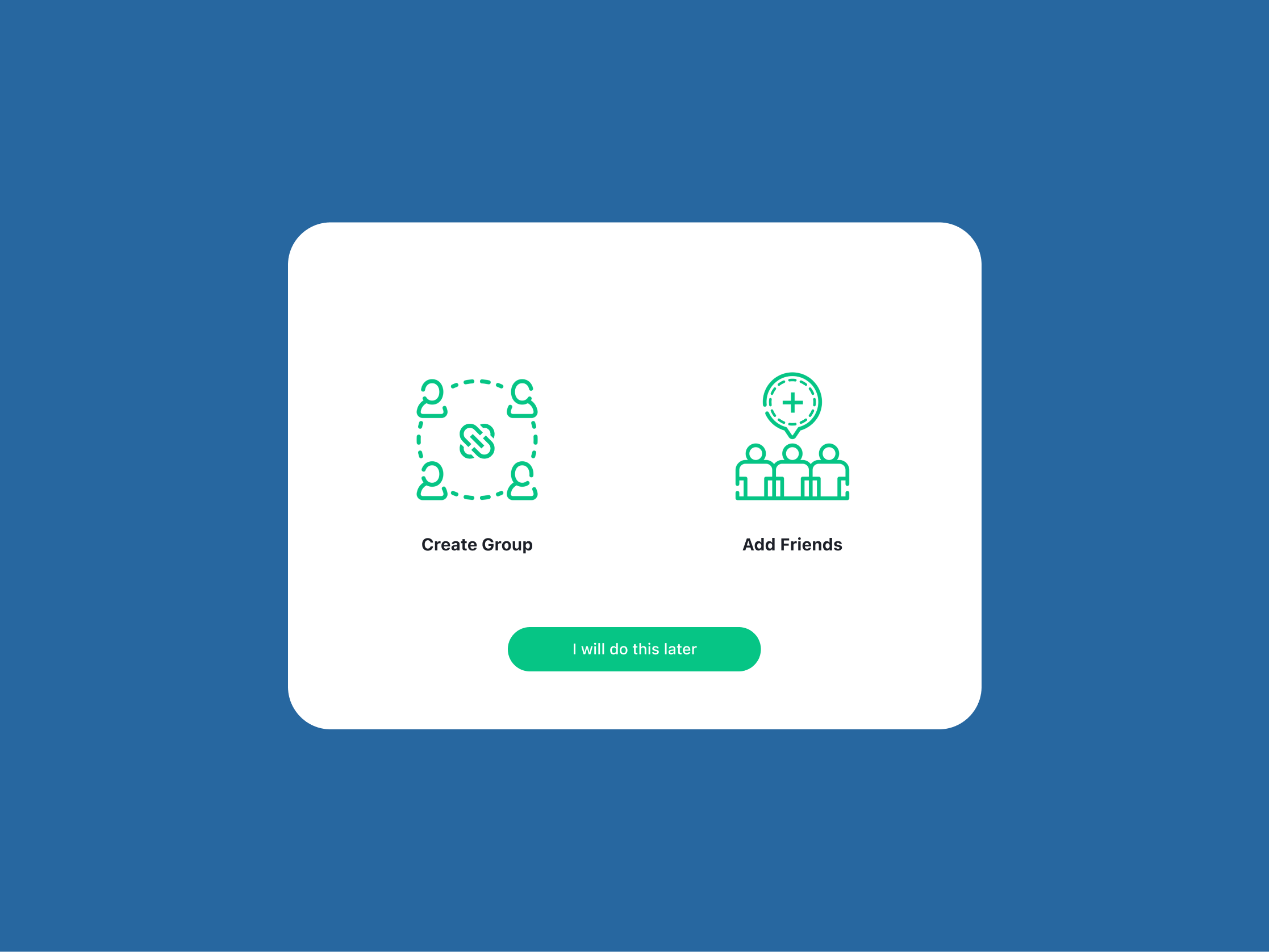
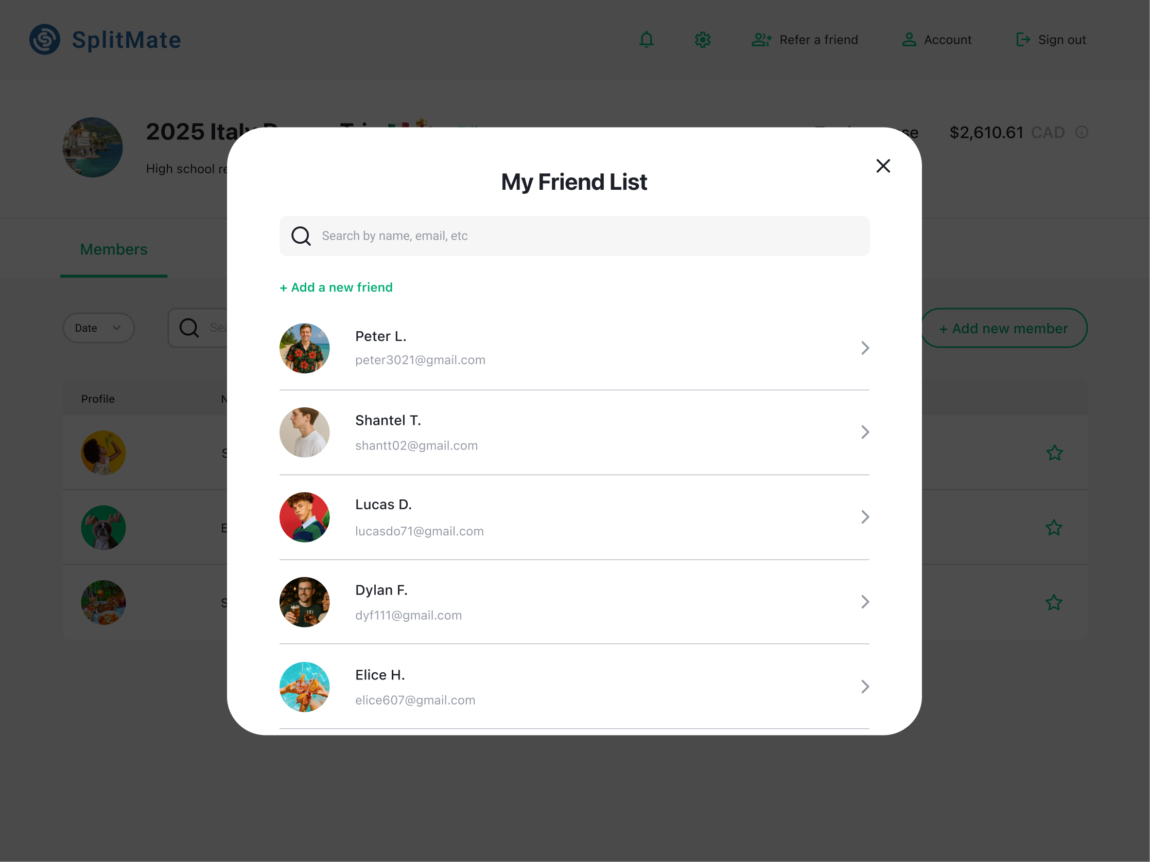
For this case study, the primary focus for MVP was to solve the core problem of group payment friction with maximum efficiency. To achieve this, I strategically prioritized Must-Have features that are non-negotiable for app utility, including the ability to add friends and members and the crucial function to split a bill both equally and unequally. These elements form the foundation of the user experience, allowing them to manage group expenses. Features like currency conversion, receipt scanning, and AI suggestions were classified as Nice-to-Haves, reserved for future iterations.
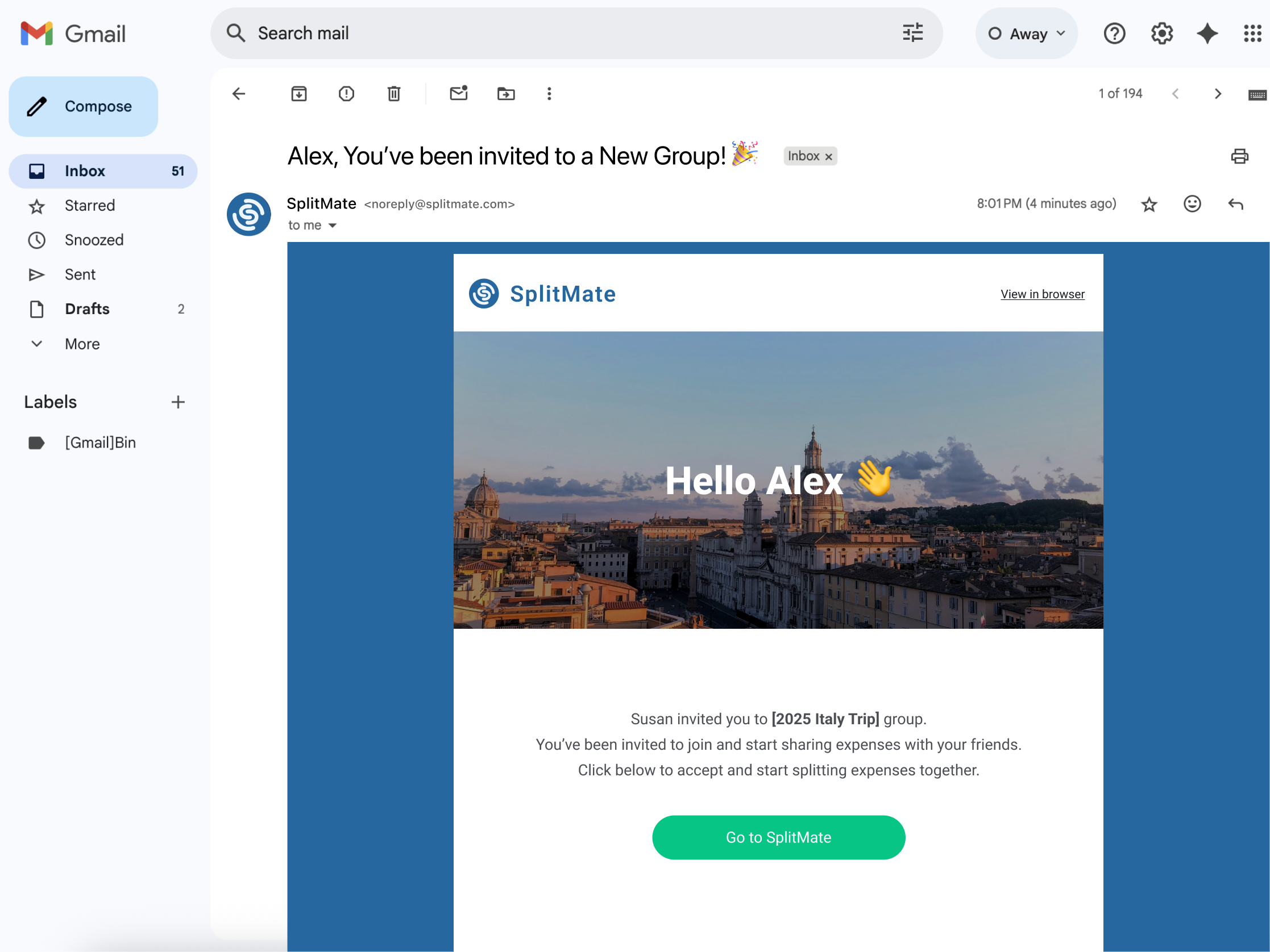
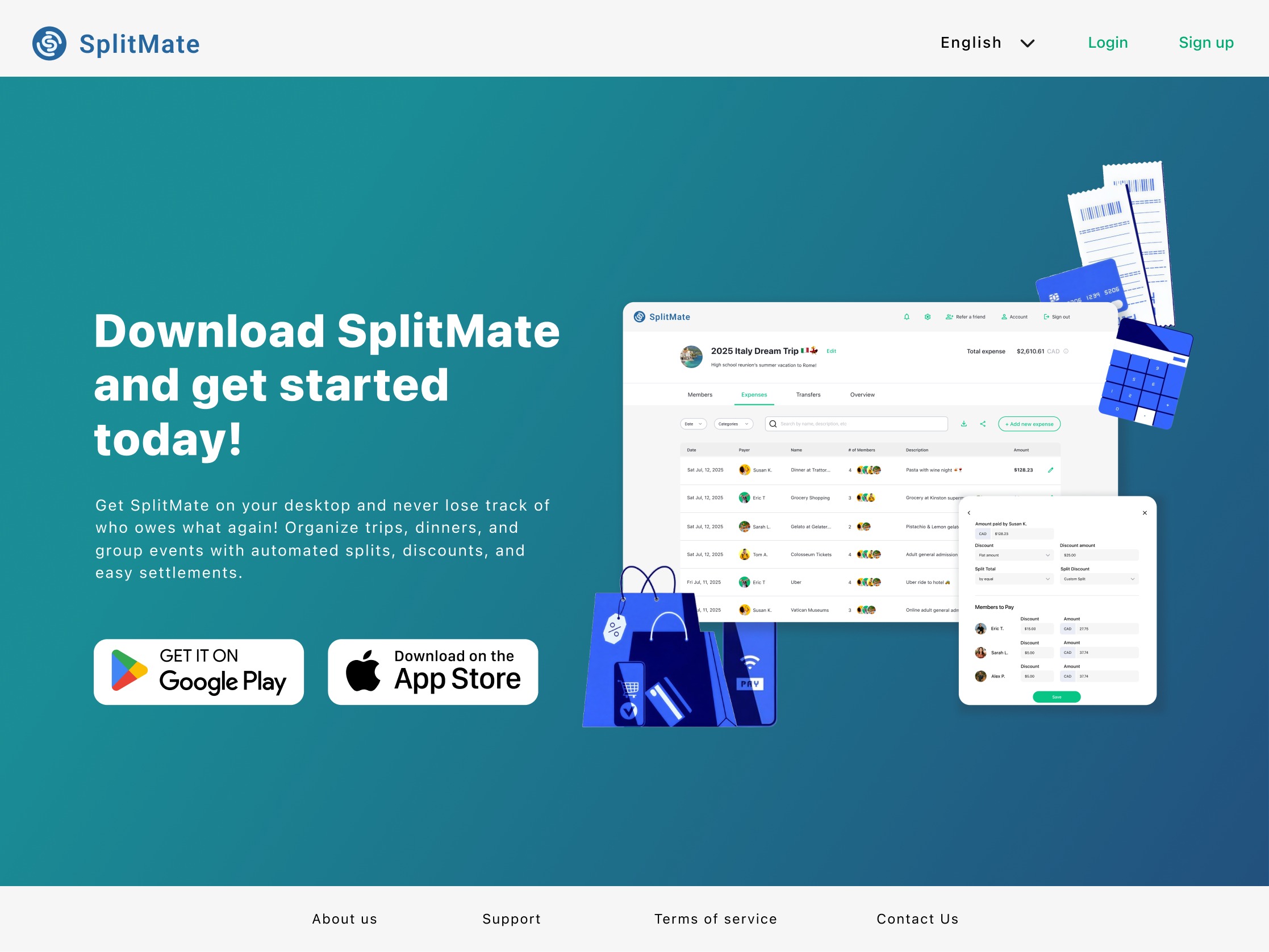
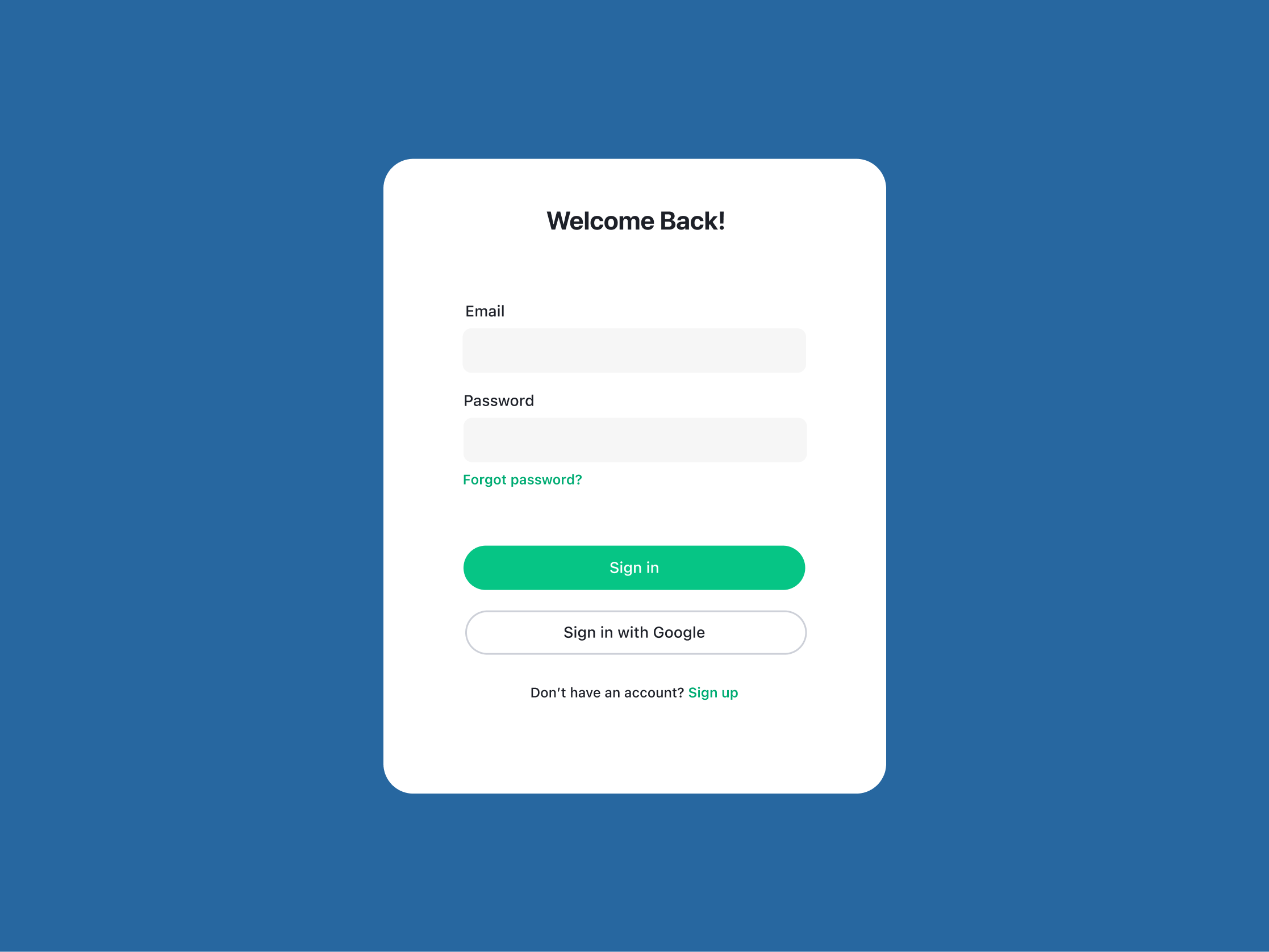
User Flow
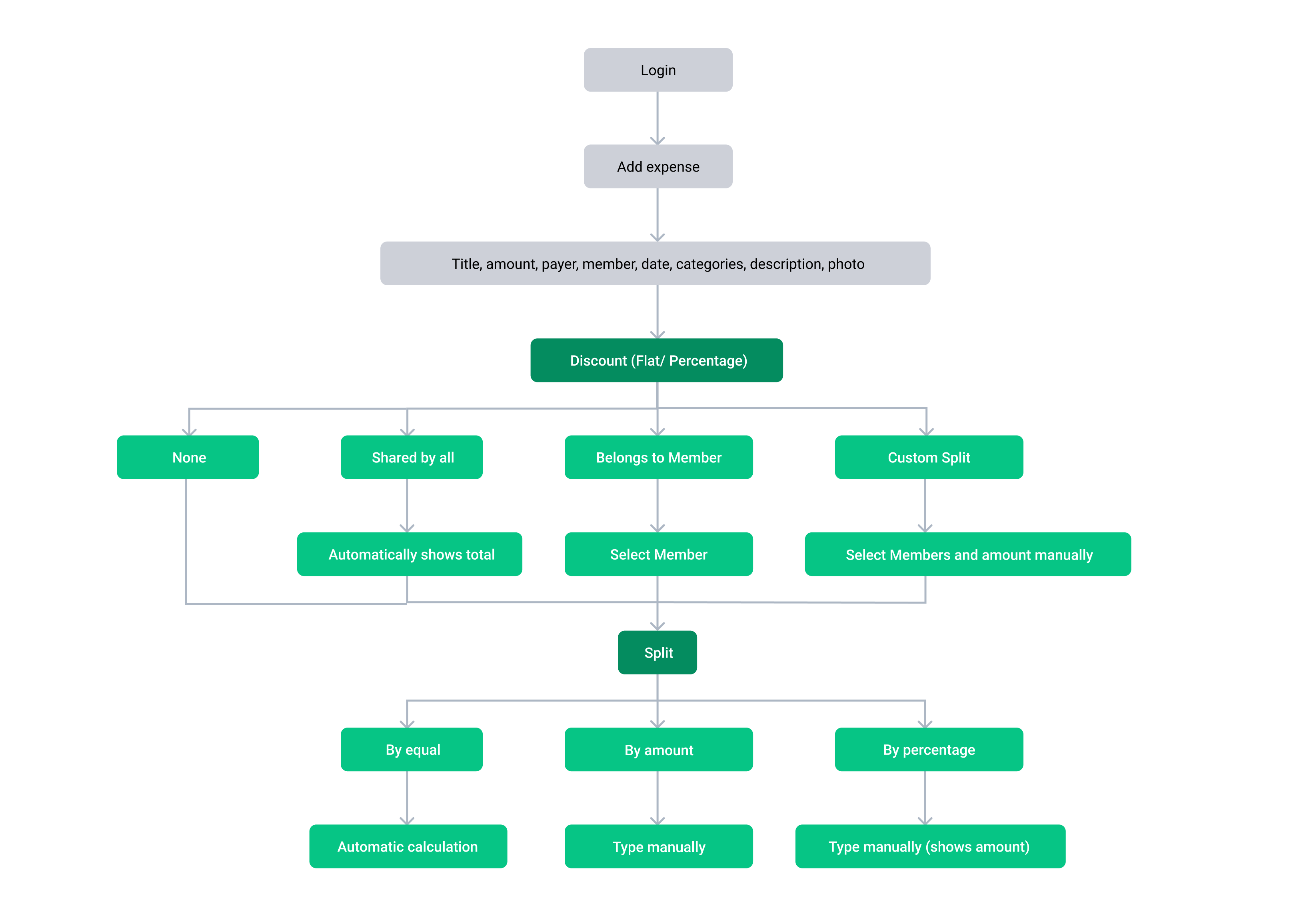
As part of the UX case study, I included a flow chart to represent the Information Architecture (IA) of SplitMate’s bill‑splitting feature. IA organizes tasks and decision paths, helping stakeholders understand how users progress before moving into screen design. By mapping the bill‑splitting process first, the flow chart provides a foundation for the low‑fi screen flows that follow.
Low-fi Screen Flow
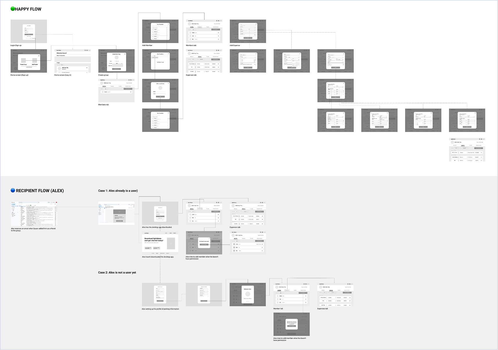
Low-fidelity screen flows were created to translate the bill-splitting user flow into structured screens and interaction sequences. Building on insights from the user flow, this stage clarified layout hierarchy and feature placement. The low-fi screens established a foundation for validating usability and informed visual refinement in the high-fidelity design stage.
Hi-Fi Design
The high-fidelity flow features 11 screens capturing the final visual style and interaction details of SplitMate, reflecting insights gathered throughout the design process.
Interaction Design Research (TD Web app)
1
Accordion Dropdown
❇️ Component description
The Accordion is a collapsible container that reveals or hides information when clicked. It helps organize content into sections, reducing clutter.
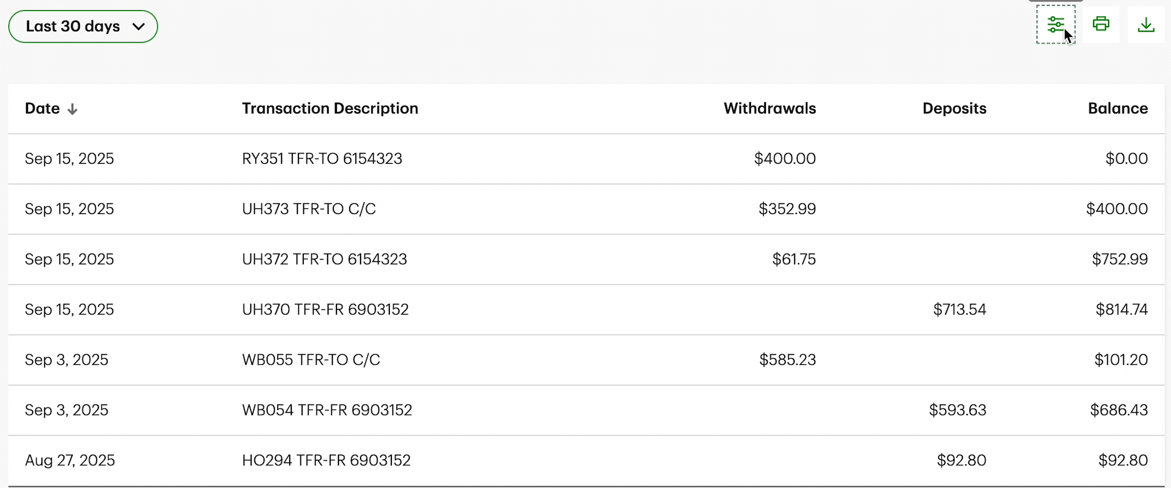
On the Transaction History page, clicking the filter icon triggers an accordion dropdown that reveals or hides filtering options, allowing users to refine displayed transactions efficiently.

Located at the bottom of the page, clicking the “Legal Notes” text expands a dropdown that reveals seven linked pages, providing users with access to detailed legal and policy information.
2
Collapsing Text Animation
❇️ Component description
The Collapsing Text animation occurs when a section is clicked, triggering the text to shrink in size as the content expands. This provides a smooth transition that draws attention to the newly revealed content while maintaining visual hierarchy and clarity.
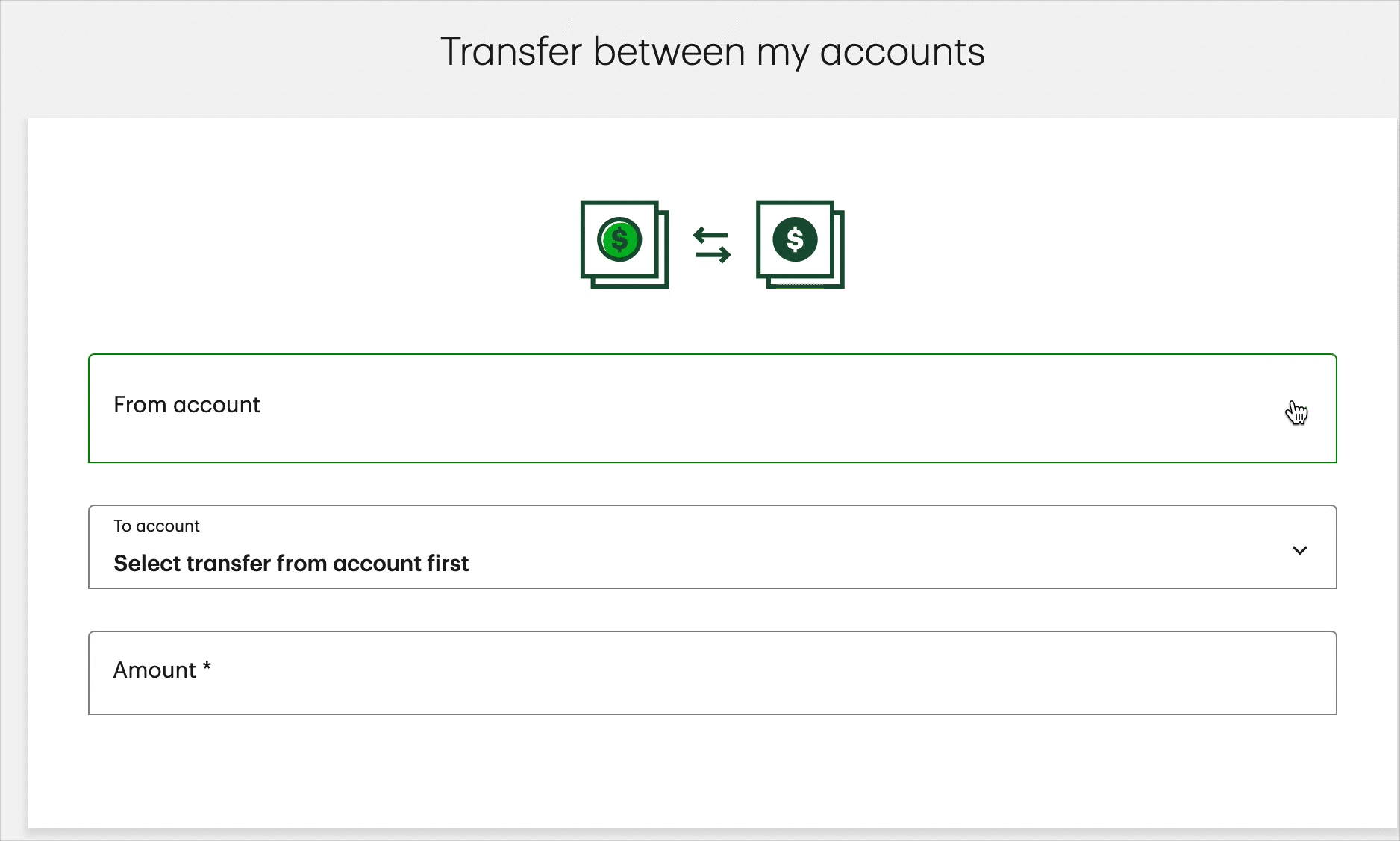
When a section is clicked on the Transfer between my accounts page, the header text smoothly shrinks in size.
3
Toggle Switch Animation
❇️ Component description
The Toggle Switch Animation lets users switch between two states, such as “Activity” and “Manage.” When clicked, the active label smoothly transitions with motions
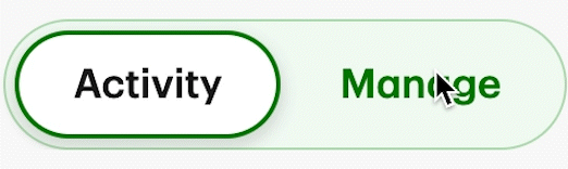
A two-state toggle that switches between “Activity” and “Manage.” When clicked, the active label smoothly transitions with motion feedback and navigates the user to the corresponding page.
I conducted this research to understand how users interact with key components of the TD web app and to get insights that I can apply into SplitMate. These findings helped me refine interaction patterns, enhance clarity, and create smoother, more intuitive user flows in both designs.
Interaction Design
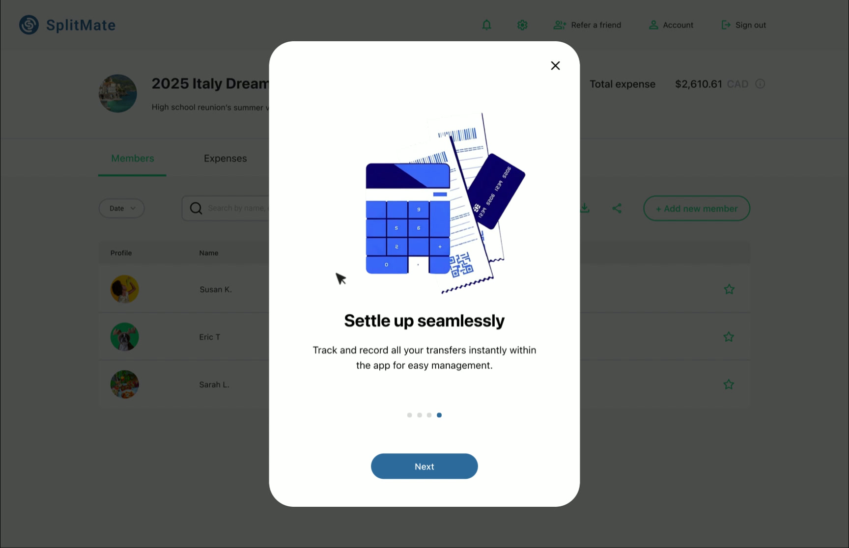
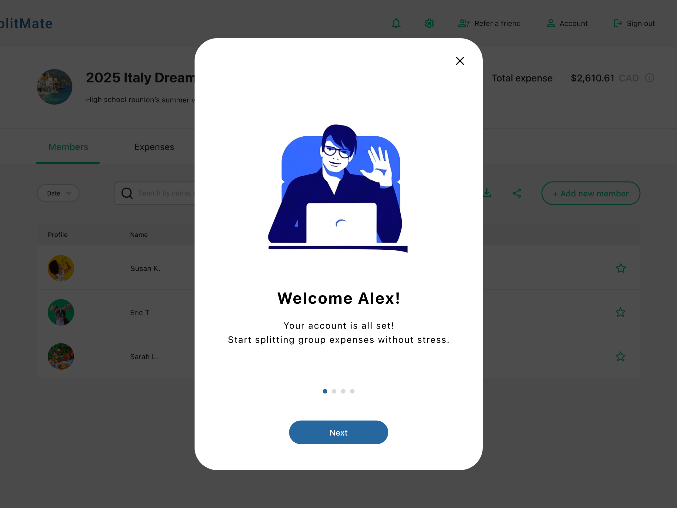
Interaction design is essential in UI/UX because it shapes how users feel and act within a product, turning static screens into intuitive experiences that build trust. To improve the onboarding carousel, I added swiping illustrations and fading text to guide users. Navigation works by mouse swipe or Next button, making the experience clear and easy to understand.
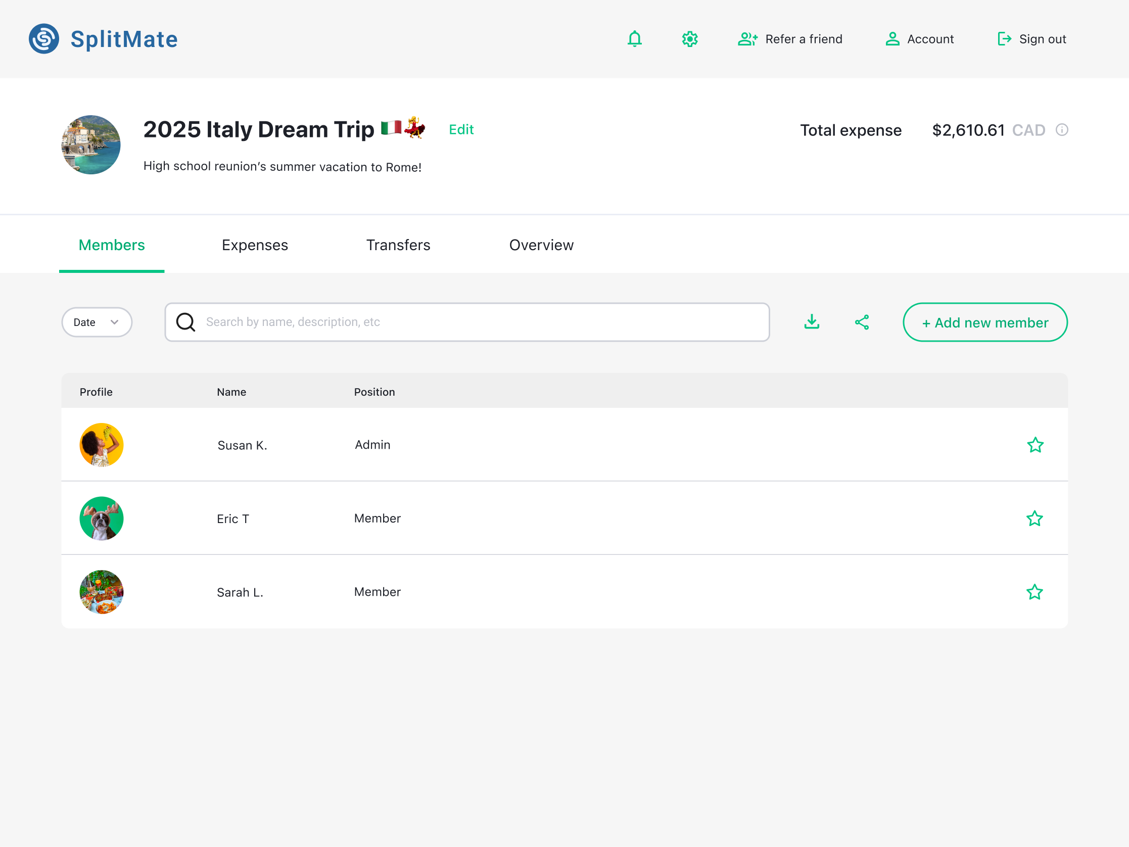
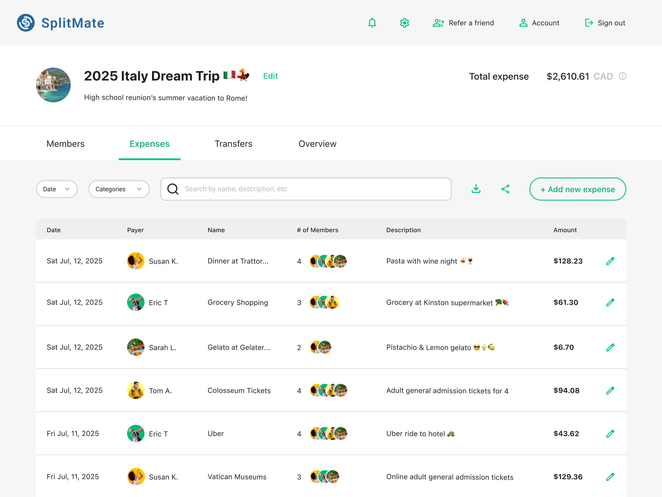
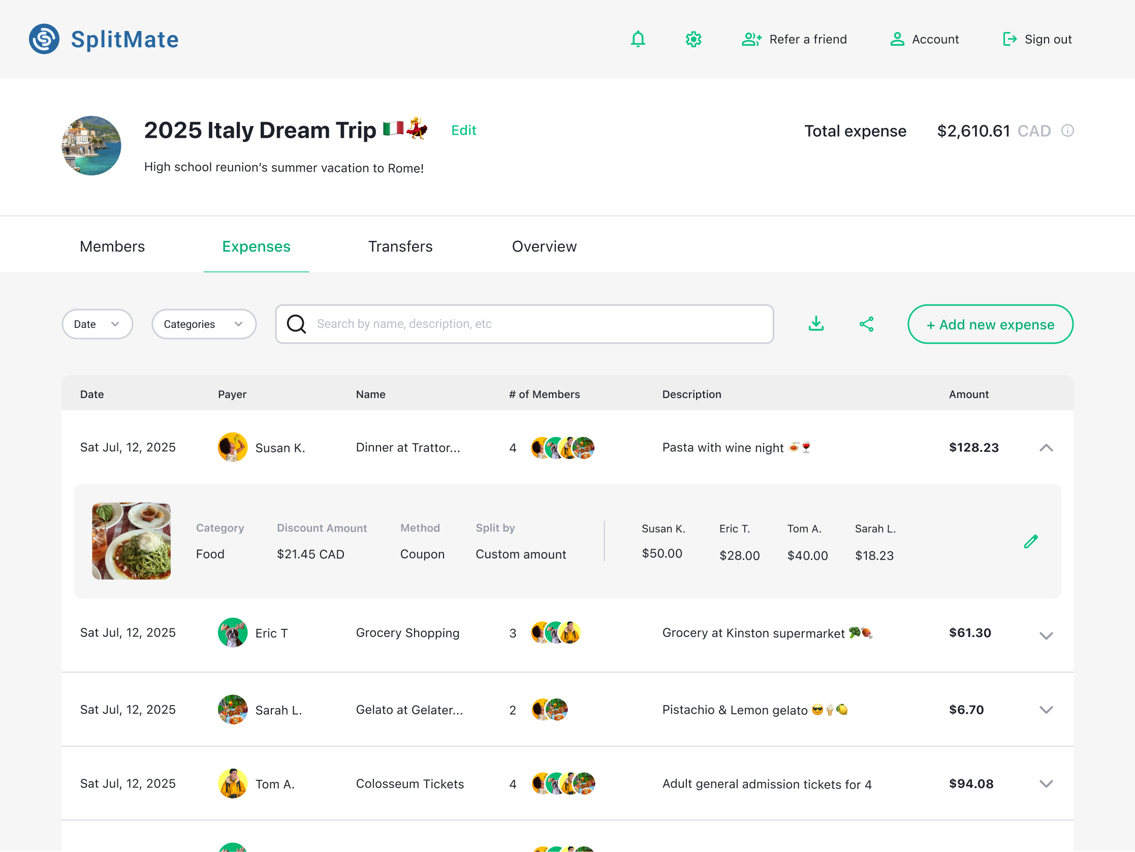
The Group page interactions show the underline bar shifting between Members and Expenses while text color highlights the active tab. Hover effects emphasize the Add New Member button, and the chevron rotates to expand or collapse expense details in an accordion-style dropdown. These interactions make group navigation faster and clearer.
Usability Testing
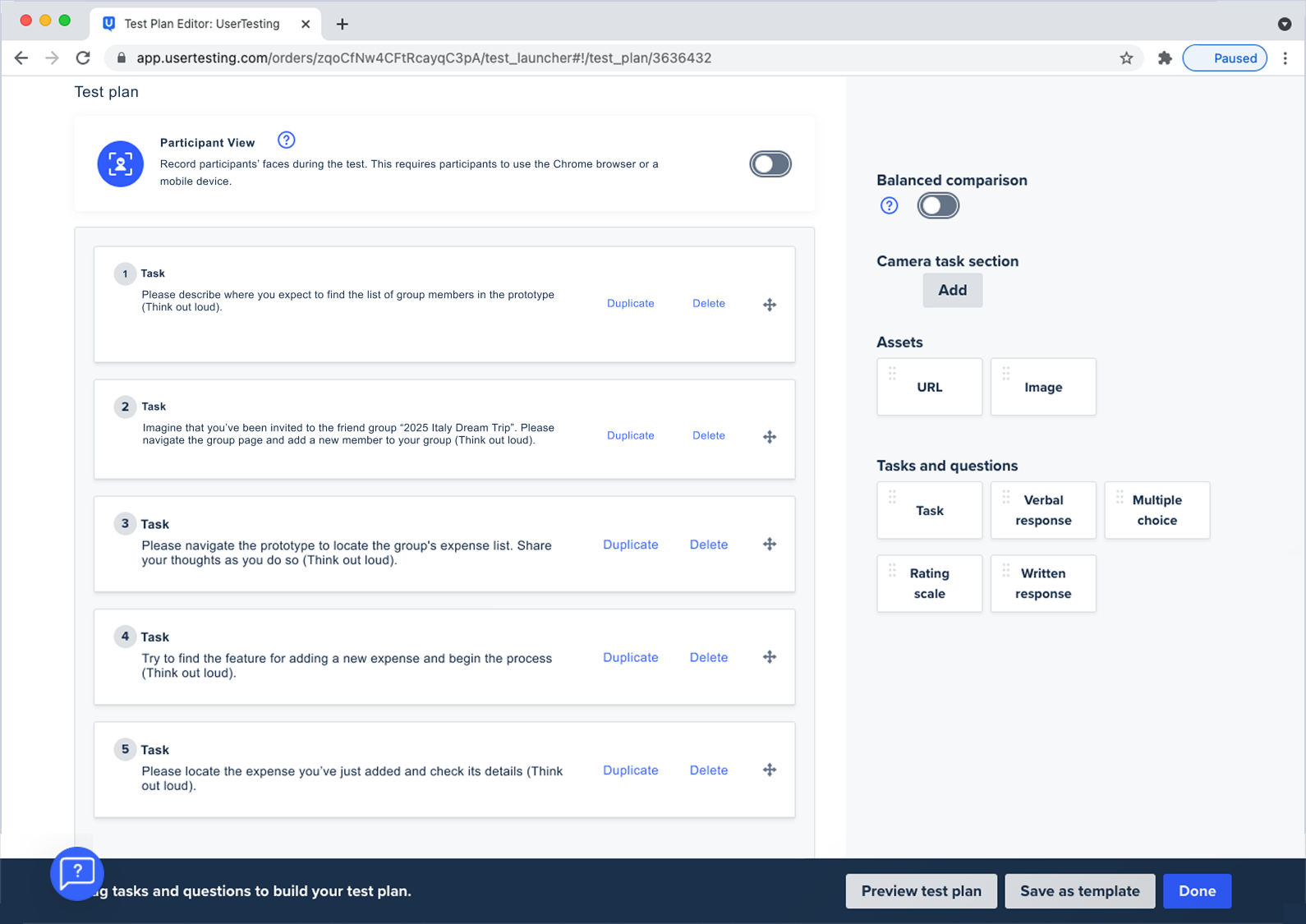
Usability testing was conducted using a prototype to evaluate whether the design supports users’ goals across key flows. Participants completed task-based scenarios using an Unmoderated testing script. Test results revealed navigation friction, unclear labels, and lack of descriptions. These insights were synthesized into key user pain points to validate design decisions, identify usability issues early.
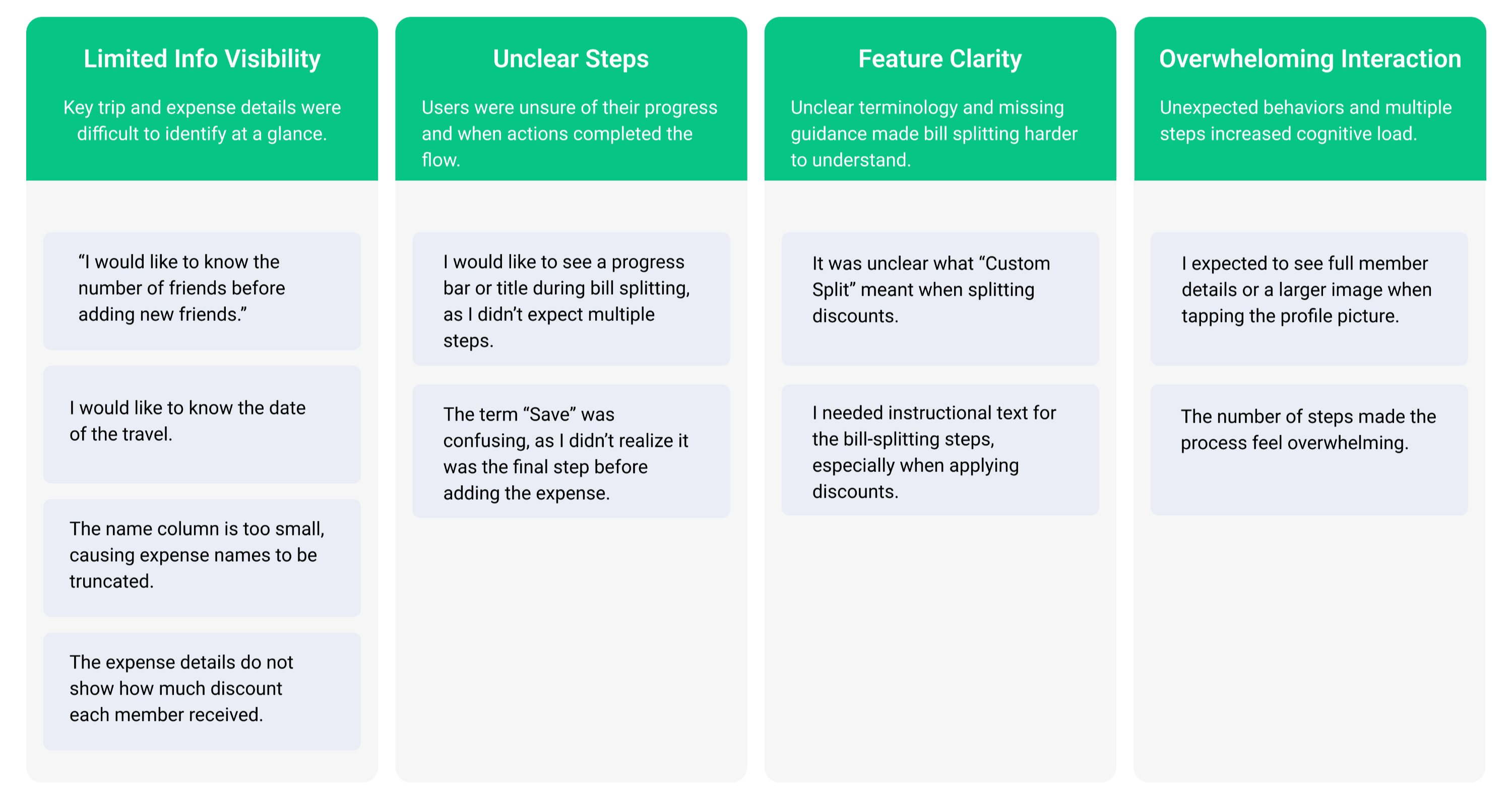
User Pain points (5 Participants)
How I Addressed the User Pain point A
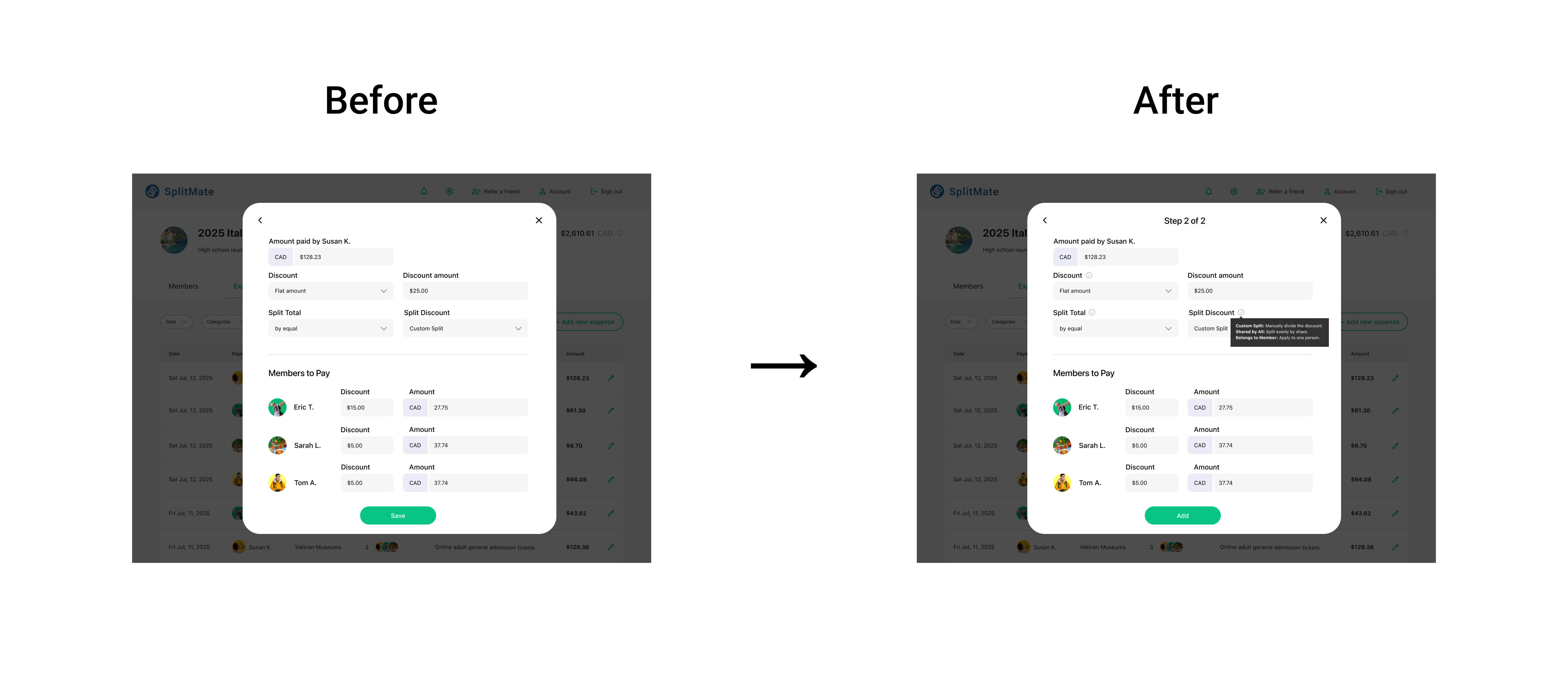
🔴 User Pain point:
I would like to know the number of friends before adding a new friends.
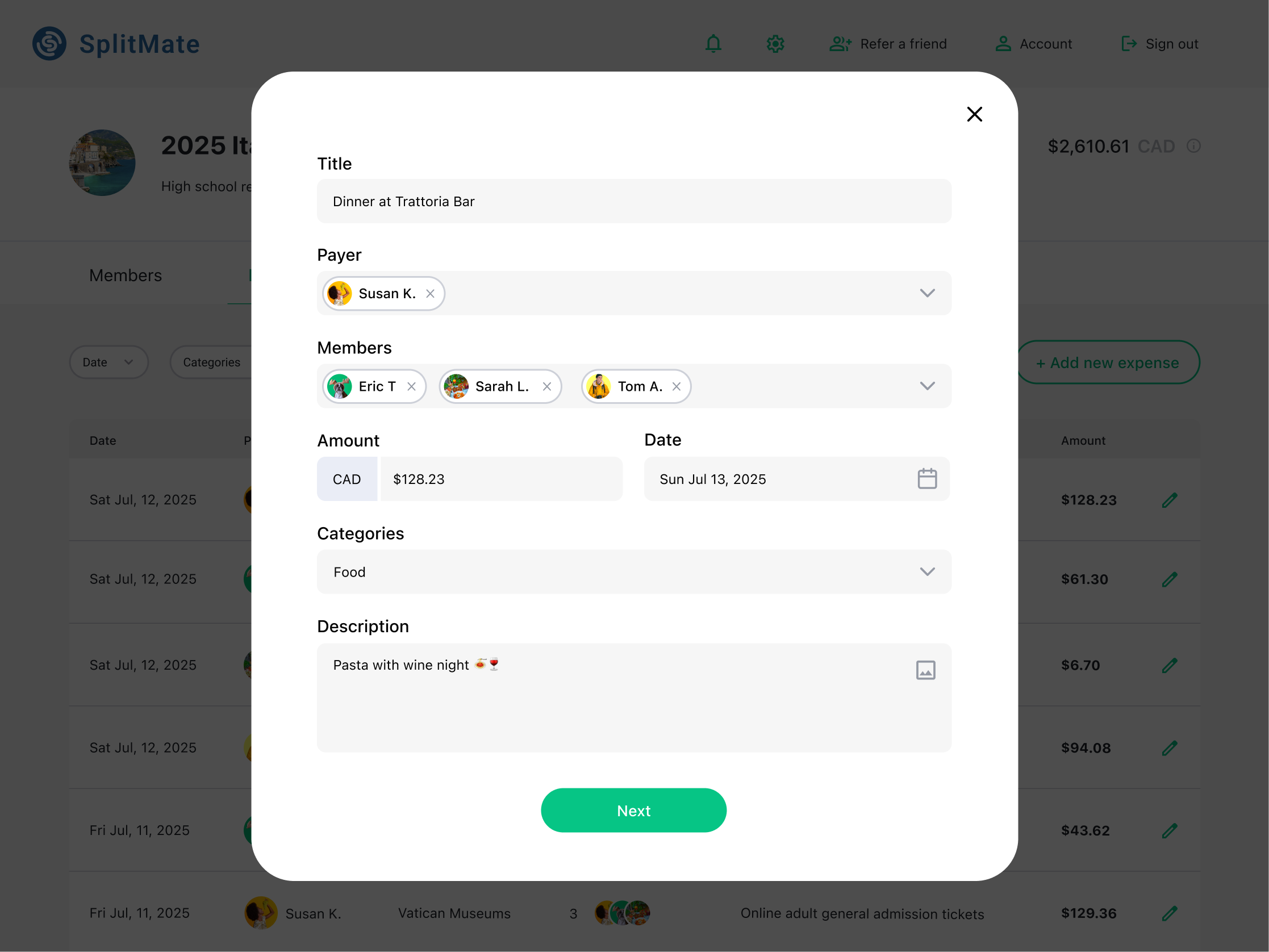
I would like to see a progress bar or title on top of the bill splitting since I wasn’t expecting the second steps.
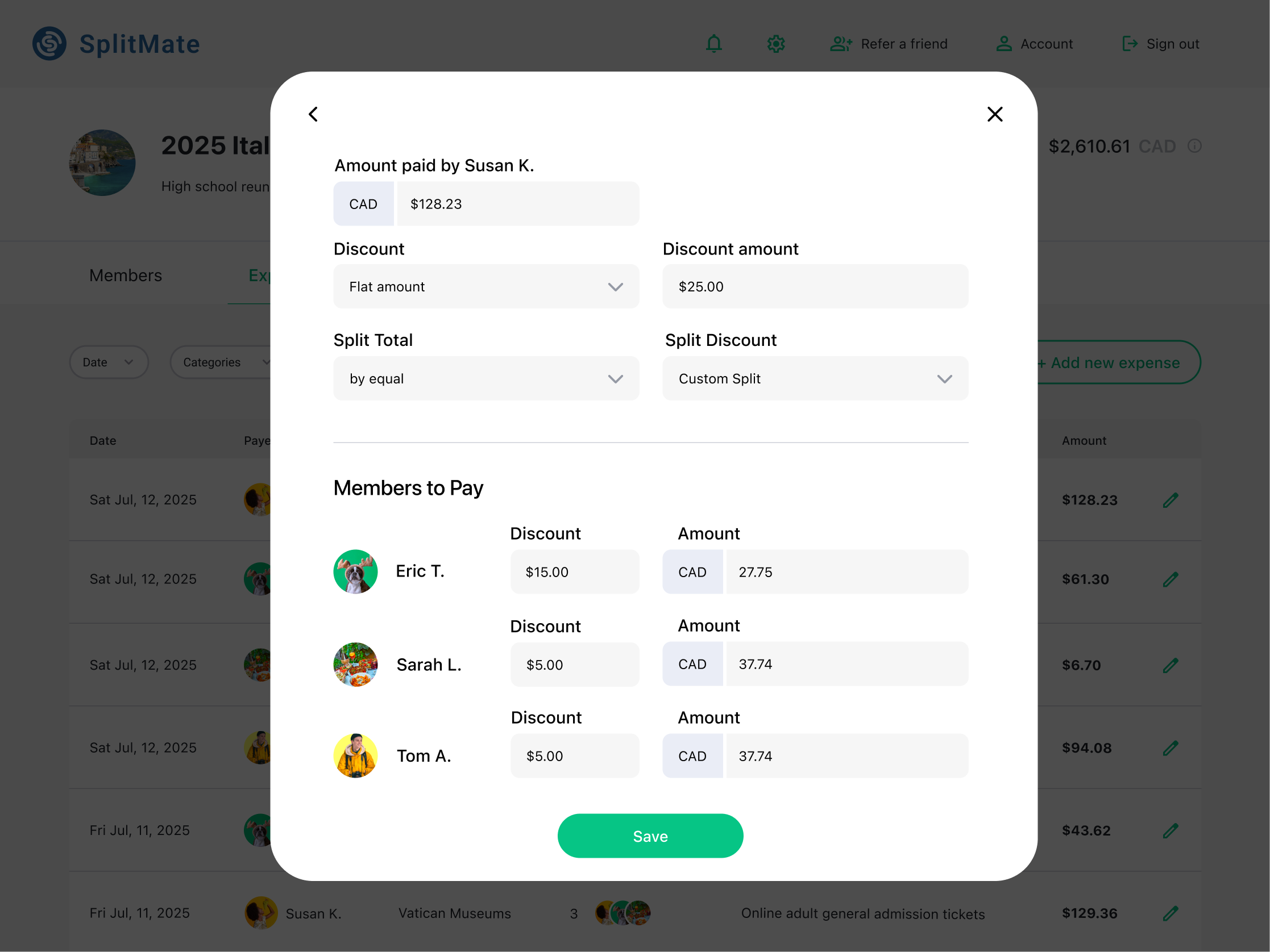
I needed the help or instruction/ description text for bill splitting steps since I was not familiar with the applying discount while splitting the bill.
🟢 Updated Design:
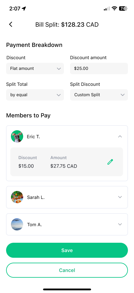
To reduce confusion during bill splitting, the second screen was updated to provide clearer guidance and expectations. The revised design introduces a progress title, “Step 1 of 2,” to signal a multi-step process, along with contextual tooltips for discount, split total, and split discount fields to support unfamiliar actions. Additionally, the primary action was renamed from “Save” to “Add” to better communicate completion and reduce hesitation, allowing users to proceed with clarity.
How I Addressed the User Pain point B
🔴 User Pain point:
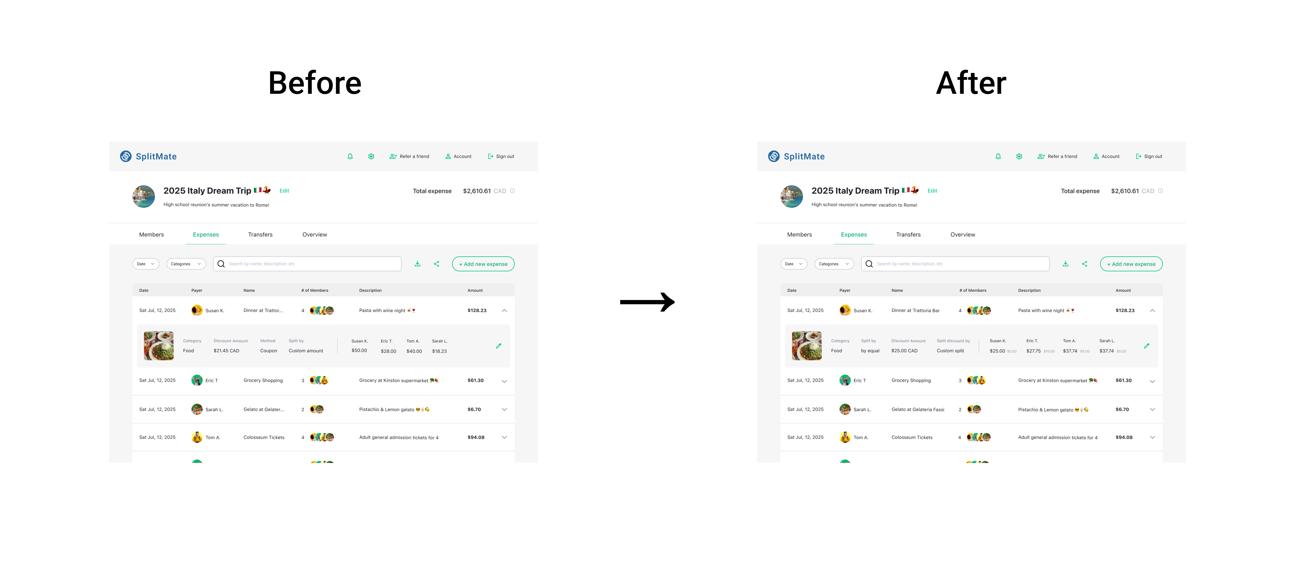
The expense detail doesn’t show who got how much of discount.
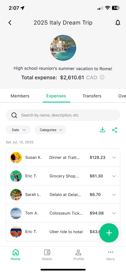
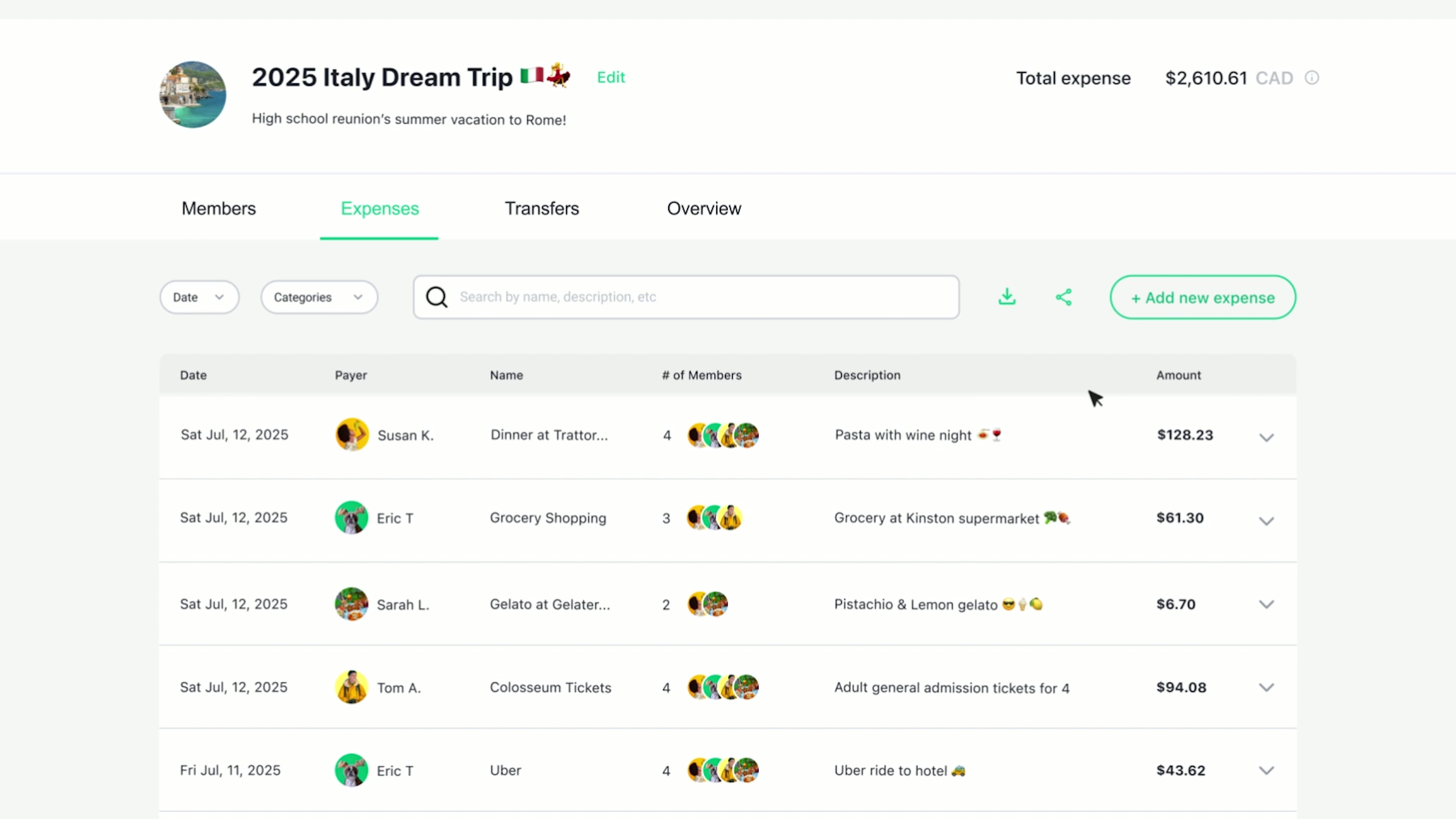
The name column is too small. The expense name is truncated. I want the full name.
🟢 Updated Design:
To improve clarity in expense details, I updated the expense list and detail view to increase information visibility. The expense name section was expanded to prevent truncation and make expenses easier to identify. In addition, a “split discount by” breakdown was added to show how discounts are distributed, with each member’s discount displayed alongside their payable amount. These changes improve transparency without adding complexity.
Responsive Design